Table of contents
The „ANALYZE Dashboard” view Copy link to clipboard
The ANALYZE Dashboard provides a graphical overview of commonly-used traceability metrics for the current project.
Choosing the data to be displayed Copy link to clipboard
By choosing an element from the drop-down menu in the top left corner of the ANALYZE Dashboard view, you can choose which data to display in the diagram:
- Trace links: Shows all available links, grouped by link type.
- Linked artifacts: Shows all available linked artifacts, grouped by artifact type.
- All artifacts: Shows all available artifacts, i.e., linked and not linked ones, grouped by artifact type.
- Not linked artifacts: Shows all available not linked artifacts, grouped by artifact type.
A counter right from each option in the drop-down menu indicated the number of links or artifacts found.
If you select a set of elements that is not empty, the dashboard displays a pie chart with an overview of these links or artifacts. It is grouped by link types resp. artifact types to give you an immediate visual impression of the element distribution in your project.
If there are no data available for the selected option, a notification will be shown in the center of the view.
Displaying legend and labels Copy link to clipboard
Check the Show legend or Show labels checkbox near the top-right corner of the view in order to see which kind of elements each section of the pie chart represents. In figure "Pie chart and drop-down menu in the ANALYZE Dashboard view" , both have been checked.
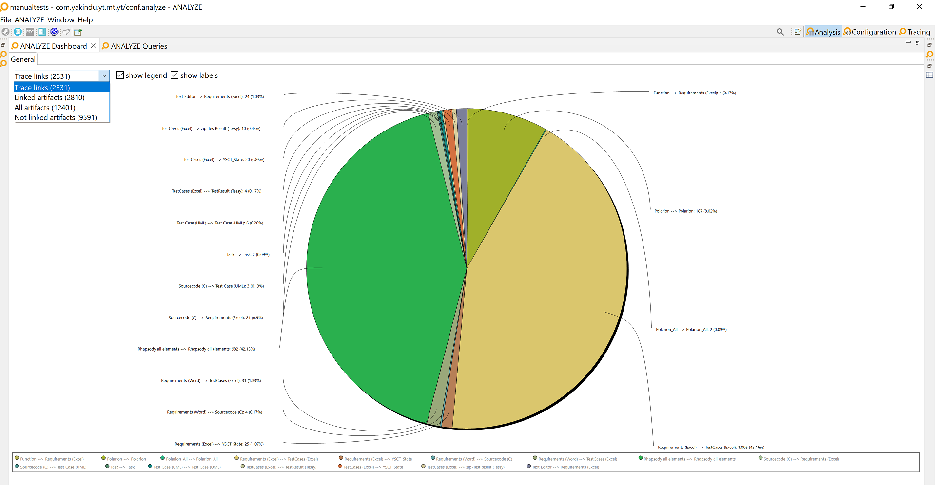
Pie chart and drop-down menu in the ANALYZE Dashboard view
The pie chart labels are showing element information of the following format: "name: count (percentage%)".
- name: name of the artifact/link type
- count: number of artifacts/links of this artifact/link type
- percentage: percentage of elements of this artifact/link type in relation to all elements shown
If you hover your mouse pointer over a pie section or legend item, a tooltip displays the element information in the format explained above.
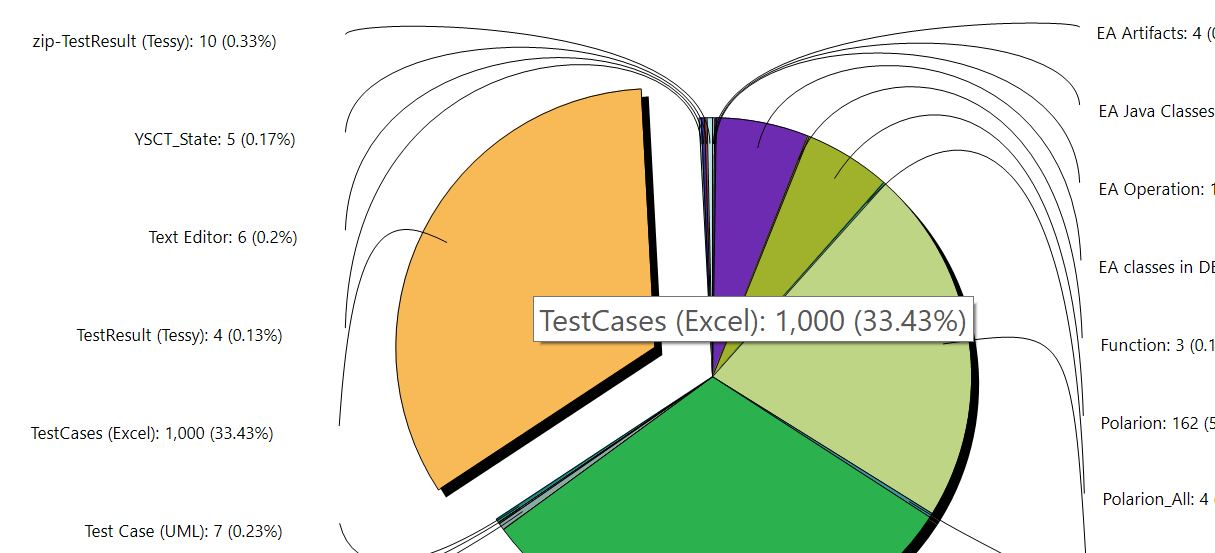
Pie chart section tooltip
Investigating links and artifacts in more detail Copy link to clipboard
The pie chart is interactive: You can click on any of its sections (or on any legend entry) to investigate the corresponding elements in more detail. A click on a pie chart section explodes it, highlights the corresponding legend entry (if the legend is visible), and displays the elements the pie chart section represents in the ANALYZE Dashboard Details view . Click again, and the actions are reversed.
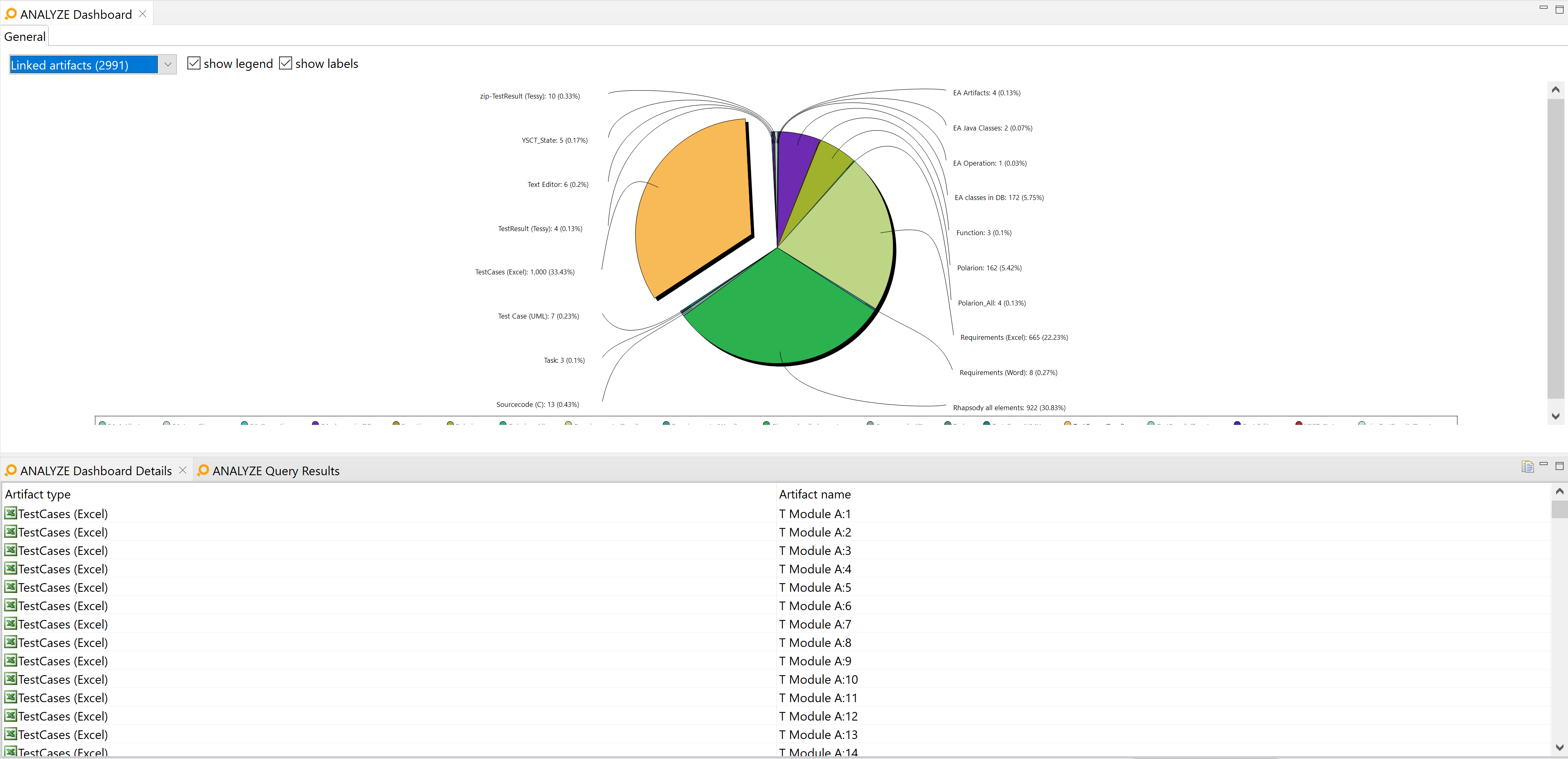
Interactive pie chart sections in the ANALYZE Dashboard view
The „ANALYZE Dashboard Details” view Copy link to clipboard
The ANALYZE Dashboard Details view is linked to the ANALYZE Dashboard. As the name suggests, it displays details on the elements selected in the ANALYZE Dashboard view. In ANALYZE Dashboard, you select one or more types of artifacts or links, and in ANALYZE Dashboard Details, you can see all the artifacts or links themselves.
The ANALYZE Dashboard Details view displays elements, i.e., links or artifacts, as a table. Each row represents one element and provides information on it. Artifact information are type, name, and origin tools. For a link, the view displays its type and the artifacts at the link’s ends.
If an element type is selected on the dashboard and the ANALYZE Dashboard Details view is closed, it will be opened. In any case, the ANALYZE Dashboard Details view will get the focus.
If no item is selected on ANALYZE Dashboard or the latter is closed, ANALYZE Dashboard Details provides either a clickable hint to open the dashboard or suggests to select a pie chart section.
Selecting an element in ANALYZE Dashboard Details displays its properties in the Properties view. If an artifact has been selected, the ANALYZE Overview view displays this artifact and its relationships to other artifacts. If a link has been selected, the ANALYZE Overview view displays its both link ends, i.e., the A and B artifacts, and their relationships to other artifacts.
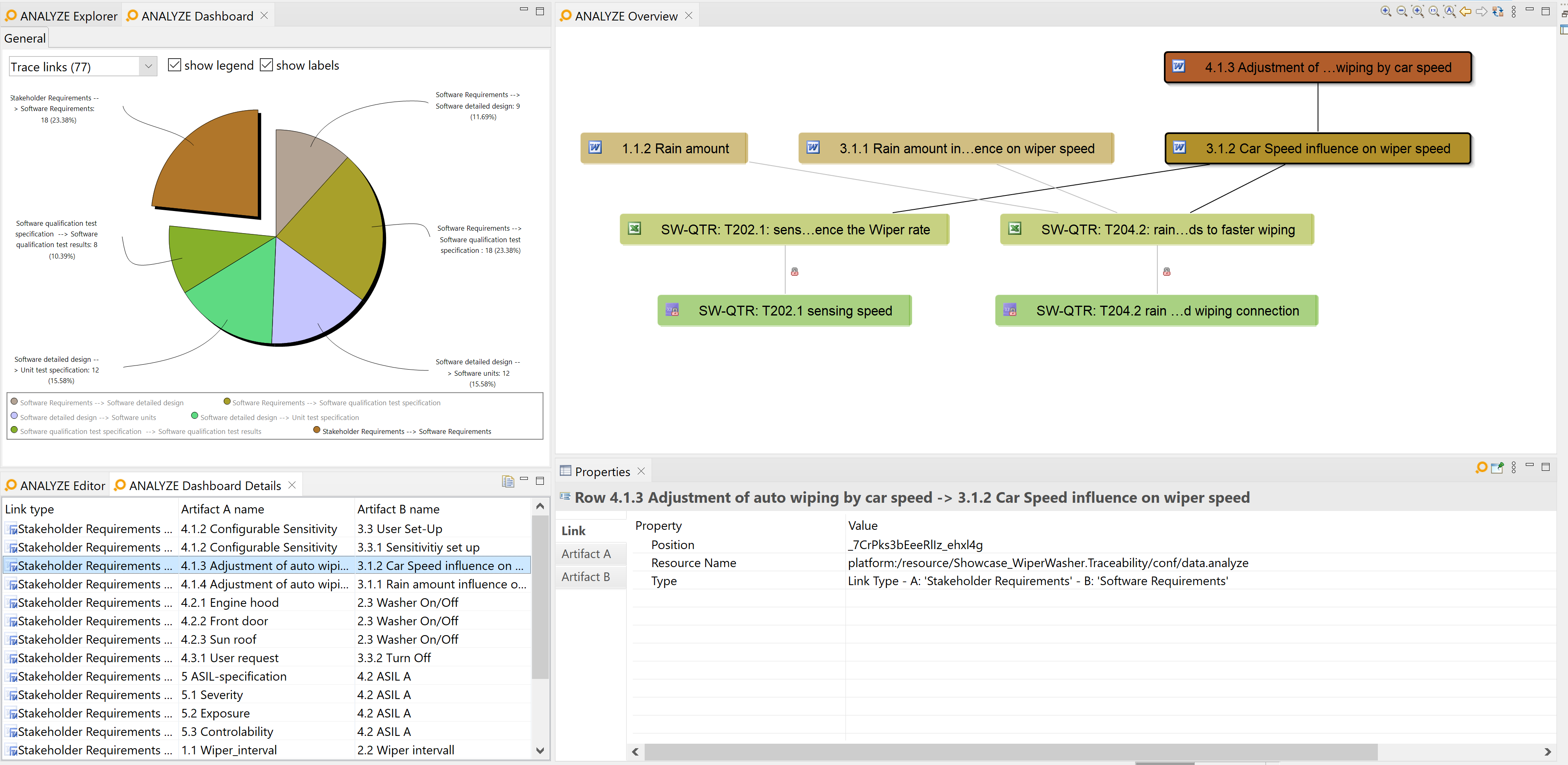
The ANALYZE Dashboard Details view
The
ANALYZE Dashboard Details view provides a
copy to clipboard
 button at the right-hand side of its title bar. Select the table rows you are interested in – pressing
[Ctrl+A] selects
all rows –, then click on the
copy to clipboard
 button. The table heading and the selected rows are copied to the clipboard as plain text. Within each line of this text, table cells are separated by
 [TAB] characters.
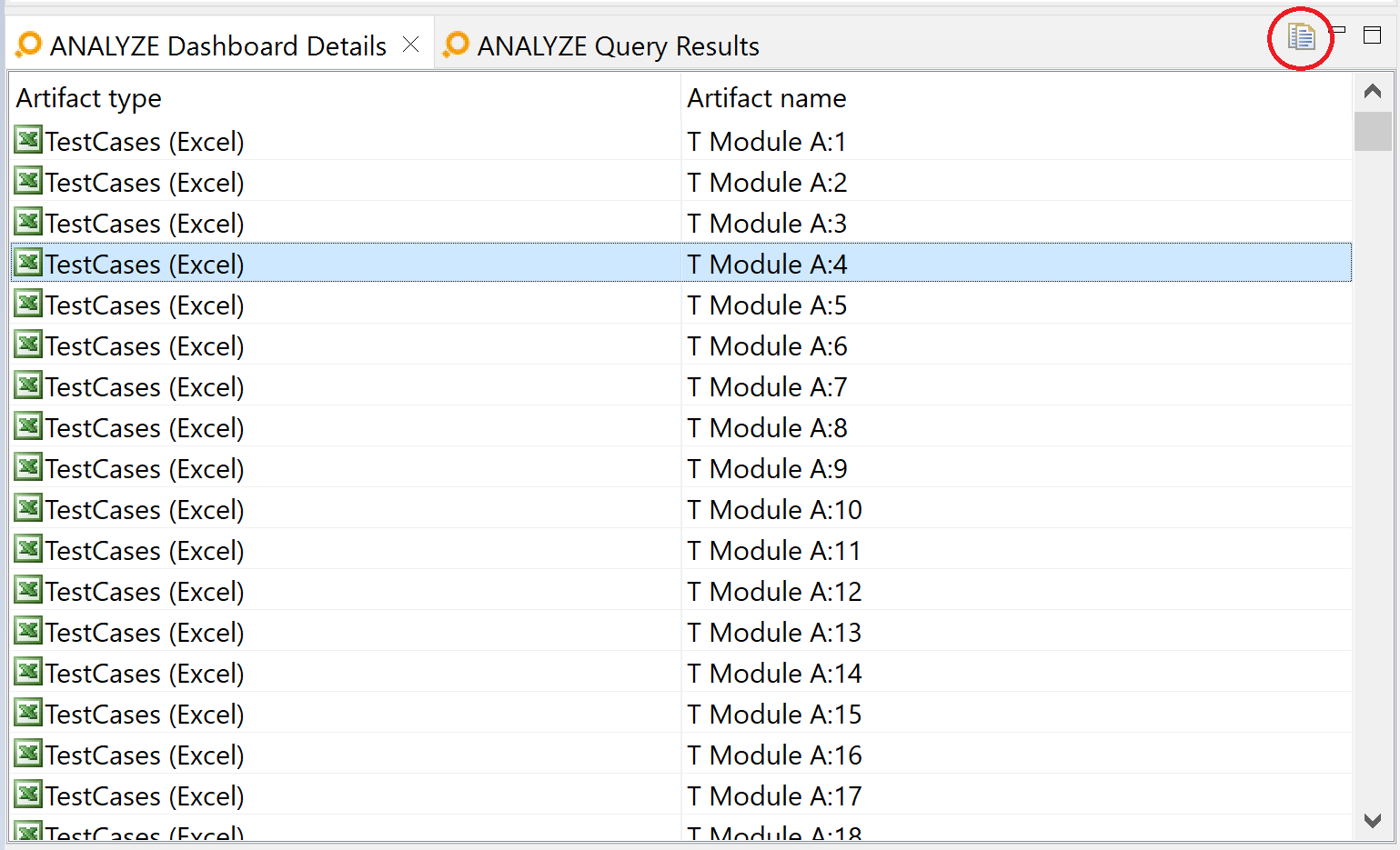
Location of the copy to clipboard button
Instead of using the
copy to clipboard
 button, you can press
[Ctrl+C] on the keyboard.