Table of contents
Editing statecharts Copy link to clipboard
This section explains how you can edit statecharts using itemis CREATE.
Creating and deleting statecharts Copy link to clipboard
Statecharts are comprised in
statechart model files. The filename extension of these files is
.sct. Their internal format is
XML Metadata Interchange or
XMI, which is an XML language.
Creating a statechart Copy link to clipboard
In order to create a new statechart, use the project explorer view:
- Right-click on a project or on a folder you want to create the new statechart in. The context menu appears.
- In the context menu, select New → Other…. The New dialog appears.
- In the New dialog, select itemis CREATE → Statechart Model and click Next >. The New itemis CREATE wizard appears.
- In the File Name field, enter a filename for the statechart file to be created. The filename extension must be .sct.
- Click Next >.
- In the wizard, select a statechart domain. Which domains are available depend on your itemis CREATE license. The Default domain for “normal” statecharts without any language integration is always available.
- Click Finish.
- If the Confirm Perspective Switch dialog appears, answer its question as you see fit.
- The new statechart file is created in the location you specified and opened in the statechart editor.
Copying an existing statechart Copy link to clipboard
In order to copy an existing statechart file, proceed as follows:
- In the project explorer view, right-click on the statechart’s filename. The context menu appears.
- In the context menu, select Copy.
- Right-click on the project or folder you want to insert the copied file in. The context menu appears.
- In the context menu, select Paste.
- If there is already a file with the same name as the file to be copied in the target project or folder – which is always the case if you are copying a file within the same project or directory –, the
Name conflict dialog appears.
- Specify a name for the new file. The Name conflict dialog and makes a suggestion, which you can modify.
- Click OK to paste the new file to the target project or folder.
- If the target project or folder does not contain a file with the same name as the source file, the copied file will have the same name as the original.
Deleting a statechart Copy link to clipboard
In order to delete a statechart file, proceed as follows:
- Right-click on the statechart file in the Project Explorer view. The context menu appears.
- In the context menu, select Delete.
- The
Delete Resources confirmation dialog appears. You have three choices:
- Click Preview > to inspect what the delete operation is going to do, if confirmed.
- Click Cancel to cancel the delete operation. Your statechart file will persist.
- Click OK to actually delete the statechart file.
Editor UI Copy link to clipboard
itemis CREATE comes with a statechart editor. This section explains the statechart editor and how you can use it to graphically edit your statecharts.
The SC Modeling perspective Copy link to clipboard
SC Modeling is an Eclipse perspective supporting the modeling of statecharts. The perspective defines the following views and their positions:
- Project Explorer (left): This view displays your workspace and projects, folders, and files contained therein. You can also use the Project Explorer to inspect the internal structure of your statechart models.
- Properties (bottom): This view displays properties, regarding the semantic model or the graphical appearance, of the selected element in the statechart editor. You can directly edit these properties in this view.
- Problems (bottom): This view displays errors and warnings existing in your workspace. Double-clicking on an entry typically opens the location of the respective error or warning.
- Tasks (bottom): This view displays any tasks you have defined in your statechart previously. Section "Working with statechart tasks" explains how to do that.
- Outline (right): This view is a bird’s eye view on the opened statechart. It also indicates the current viewport for better orientation in large models.
You can change the positions and sizes of these views, you can delete them, or add more views, using standard Eclipse mechanisms.
Canvas Copy link to clipboard
The canvas is the statechart editor’s drawing area. When you create a new statechart model, the canvas comprises the definition section and a single region.
The following list gives an overview of what kind of actions you can perform on the canvas:
- Add or remove a region
- To add a region to the canvas, select Region in the editor palette, then click on the canvas location you want to place the region.
- To remove a region from the canvas, select the region, then
- press the
[Del]key, or - select Delete from model in the context menu, or
- select Edit → Delete in the menu bar.
- press the
- Zooming
- Press and hold
[Ctrl]and turn the mouse wheel to zoom in or out. - Right-click on the canvas to open its context menu. In the context menu, several zooming functions are available in the Zoom submenu.
- Press and hold
Editor palette Copy link to clipboard
The editor palette provides you with a set of various actions and statechart editing tools. By default, the palette is located right of the canvas, but you can also drag it to the left.
You can hide the palette by clicking on the small triangle on the right-hand side in the palette’s title bar. Click on the triangle again to make the palette reappear.
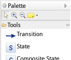
Editor palette
Editing action tools Copy link to clipboard
Below its title bar, the palette contains a toolbar with the following editing action tools (from left to right):
| Symbol | Action | Description |

|
Select | Left-click at an object to select it. |

|
Zoom in | Left-click to zoom in. Press
[Shift] and left-click to zoom out. Drag to zoom to selection.
|

|
Zoom out | Left-click to zoom out. Press
[Shift] and left-click to zoom in.
|

|
Note | Create a note, a text or a note attachment. |
Statechart elements tools Copy link to clipboard
The palette comprises a couple of tools serving to add statechart elements to the diagram (from top to bottom):
| Symbol | Description |

|
Adds a transition. |

|
Adds a state. |

|
Adds a composite state. |

|
Adds an orthogonal state. |

|
Adds a region. |

|
Adds an entry point. |

|
Adds a shallow history state. |

|
Adds a deep history state. |

|
Adds a final state. |

|
Adds an exit point. |

|
Adds a choice. |

|
Adds a synchronization. |
Outline view Copy link to clipboard
The Outline view allows you to keep the big picture of your statechart model and navigate it easily. It displays the model outline either as a graphical overview or as a hierarchical outline.
Graphical overview Copy link to clipboard
Click on the Overview icon in the Outline view’s title bar to engage the graphical overview.
While the statechart editor window – due to zooming or the size of the whole statechart – might display a cutout only, the Outline view shows the whole diagram as an overview. It is scaled down as needed to completely fit into the available area.
A light-grey overlay rectangle represents the statechart editor’s viewport.
- Drag this rectangle with your mouse to move the statechart editor’s viewport.
- Click into the outline view to position the rectangle’s center to the point you have clicked.
Hierarchical outline Copy link to clipboard
Click on the Outline icon in the Outline view’s title bar to engage the hierarchical outline.
Problems view Copy link to clipboard
The problems view by default lists all errors, warnings and other types of messages in all open projects.
The messages are grouped by message type, typically “error” or “warning”. Click on the show/hide symbol to open or close the respective message group’s contents.
Double-clicking on an entry in the problems view takes you directly to the resource or model element causing the problem.
You can configure the problems view in a multitude of ways, e.g., to group entries by different criteria, to sort them in a specific way, or to restrict them to certain projects. You can even define multiple problems views, each with different selection or display criteria.
To start configuring the problems view, click on the small triangle pointing downwards in the Problem view’s title bar. A drop-down menu will open and display the options that you have.
To configure the view click the small triangle pointing downwards in the view’s title bar. A drop-down menu opens and shows the options you have.
Please note: The problems view reflects the error/warning status of persisted statecharts only, i.e., statecharts that have been saved to the statechart file. If you create an error during editing, for example a new state that is not (yet) connected to any other state, the respective element will have an error marker on the canvas, however, it will not appear in the problems view, unless you have saved the statechart. The same holds true for resolved errors: An error will disappear from the problems view only after you saved the fixed error to the statechart file.
Editing states and other nodes Copy link to clipboard
Generally, there are two different ways to edit states and other nodes:
- Using the graphical editor to modify a node in the diagram.
- Selecting a node and editing its properties in the properties view.
There are certain properties that you can only edit with one of these methods. For example, to modify a state’s position or size, you have to use the statechart editor. To change a state’s transitions' priorities, you have to use the properties view.
Editing transitions Copy link to clipboard
Generally, there are two different ways to edit transitions:
- Using the graphical editor to modify a transition in the diagram.
- Selecting a transition and editing its properties in the properties view.
There are certain properties that you can only edit with one of these methods. For example, to add guidance points to a transition’s arrow, you have to use the statechart editor. To change a transition’s arrow’s color, you have to use the properties view.
Editing the documentation of states and transitions Copy link to clipboard
You can attach documentation to states and transitions. In this context, documentation is some text offering additional information to a human reader. In the model, it does not serve any functional purpose.
By default, a state’s rectangle shows the state’s behaviour, and a transition shows its expression alongside its arrow. You can instead display an objects’s documentation, i.e., the documentation of a state or transition:
- Right-click on the object.
- In the context menu, select Toggle documentation.
- The object now shows its documentation in place of the formerly displayed text.
In order to return back to the object’s normal view, select Toggle documentation again.
While the documentation is shown, you can modify it in the statechart editor. Double-click on the documentation text field to start editing it. Click outside the state or transition to quit editing.
The properties view of states and transition always shows both documentation and statechart language elements side by side in different compartments. This might be a more comfortable way of editing any of them.
Editing regions Copy link to clipboard
In a statechart model, you can have
- top-level regions, which are directly placed on the canvas, and
- regions inside of composite or orthogonal states.
Their graphical representation differ somewhat, thus editing them is also somewhat different.
Editing top-level regions Copy link to clipboard
You can place a top-level region anywhere on the canvas, and you can change its size at will. To change the location or the size of a region, use the graphical editor. Drag the region to move it elsewhere. Use a selected region’s handles to resize it.
Editing regions in orthogonal states Copy link to clipboard
Regions inside an orthogonal or composite state are confined by their enclosing state. They are sized automatically, depending on their contents, and they are arranged either vertically or horizontally.
You can toggle between vertical and horizontally representation of regions in an orthogonal state as follows:
- Right-click on the orthogonal state’s title. The context menu opens.
- In the context menu, select Toggle Subregion Alignment.
- The layout of the regions switches from horizontal to vertical or vice versa.
Changing the name of a region Copy link to clipboard
You can change the name of a region in the statechart editor as well as in the properties view.
- In the statechart editor,
- double-click on the region’s current name,
- edit the name in the text field that appeares after double-clicking,
- press the
[Return]key to finish editing.
- In the properties view,
- modify the Region Name property. It is a region’s only property you can access through the properties view.
Editing hierarchies Copy link to clipboard
Statecharts can get rather big and complex. Composite states are a way to reduce complexity and thus make statecharts easier to create, comprehend and maintain. A composite state comprises a state machine of its own within a region. The states belonging to such a nested state machine are called substates. Orthogonal states are a generalization of composite states, comprising two or more independent state machines in separate regions that are executed virtually concurrently.
A complementary way to mitigate the size of large statecharts are subdiagrams. A subdiagram externalizes the possibly large region(s) contained by a composite state into a subdiagram. In this case the composite state no longer displays its substates. Instead it is visualized very similarly to a regular state. The only difference is a small icon in its lower right corner, marking it as a composite state and giving access to its internal structure: the subdiagram. This way a composite state consumes much less space and gives the user the opportunity to better envision the overall picture. Section "Using subdiagrams" explains how to work with subdiagrams, how to create them and how to inline them again, if needed.
Composite states resp. subdiagrams can be nested to any depth.
The statechart editor provides various refactorings to support editing these hierarchies.
Using subdiagrams Copy link to clipboard
As a statechart grows, it may easily become too big to still give a comprehensive overview of the whole model. Subdiagrams come as a solution. Basically, you can “fold away” a composite state into a subdiagram.
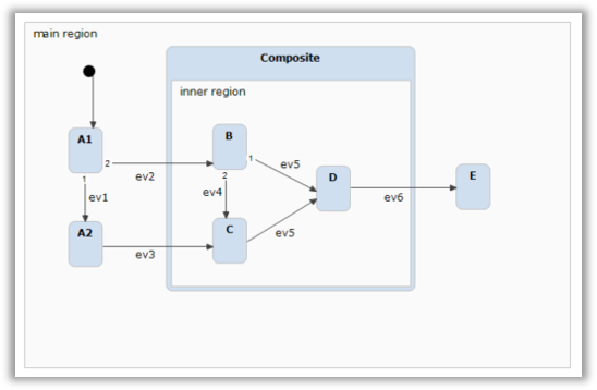
Composite state
When the Extract Subdiagram refactoring is executed on a composite state, all containing regions are extracted into a separate diagram. The composite state no longer clutters the diagram with all its internal details, but instead appears almost like a normal state. The only difference is a small decorator icon in the lower-right corner of the state, indicating the existence of a subdiagram. When you hover over this decorator with the mouse cursor, you’ll see a small preview of the subdiagram’s content.
Extracting a subdiagram creates entry and exit points in the subdiagram as needed.
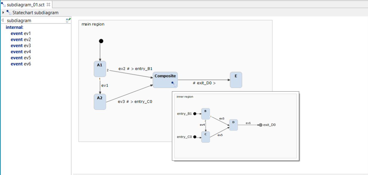
Subdiagram pop-up window
A click on the decorator opens the subdiagram in a separate editor tab. The breadcrumb at the top allows easy navigation throughout the hierachy levels.
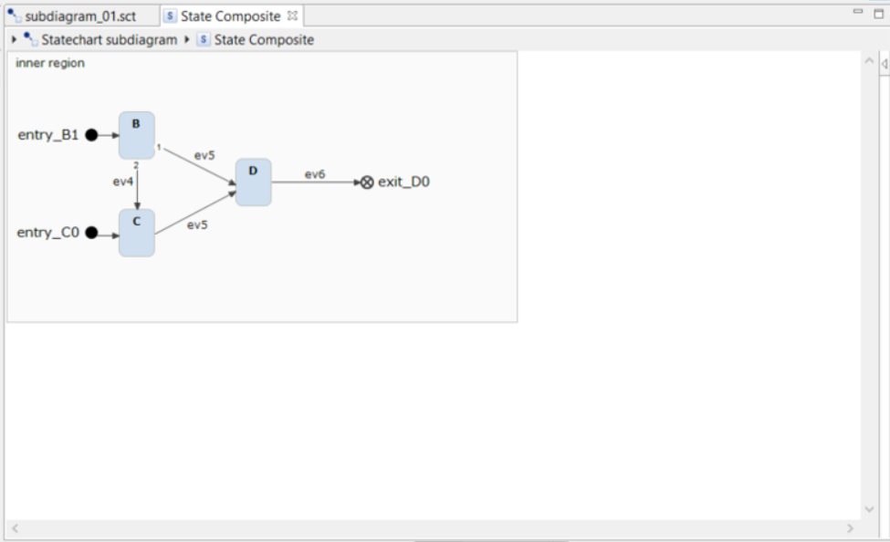
Subdiagram editor
Using the inlining subdiagram refactoring, you can turn a subdiagram back into the composite state.
Using the definition section Copy link to clipboard
By default, a statechart’s definition section is positioned at the left-hand side of the canvas.
You can edit the definition section in two different modes: Legacy mode and the new pinnable mode. Starting with version 3.3 of itemis CREATE the pinnable mode is the default editing mode.
Legacy mode Copy link to clipboard
Legacy mode is the definition section’s traditional editing mode, which has been available in itemis CREATE for a long time already.
To edit the definition section, double-click into it and enter your statements. While editing, syntax highlighting is applied to the text in the definition section. To quit editing, click outside the definition section. Now the text will appear without any syntax coloring.
Technically, the definition section is part of the canvas. If you print the canvas or save it to an image file, the definition section is included in the result. Definition section and top-level region are always scrolled in sync, which might have the rather unwanted effect that your statechart diagram is scrolled off your screen if you have a very long definition section and you are editing something down below in it.
Pinnable mode Copy link to clipboard
Pinnable mode is an improved editing mode that has been introduced with itemis CREATE 3.20. However, it is slightly incompatible with previous versions, so you have the choice to use it or not.
In pinnable mode, the definition section can be either part of the
canvas (“inlined”) or not (“pinned”), and you can change that at will. The definition section comes with a little pin symbol
 at its top-left. Click on it, and the definition section will be detached from the canvas. This has a couple of advantages:
- You can edit definition section and graphical statechart independently of each other. In particular, you can scroll either area as you like, while the other one will remain where it is.
- The definition section is syntax-highlighted all the time.
- If you don’t need to see the definition section you can collapse resp. fold it away by clicking on the little triangle in the top-left corner. Click on it once more to make the definition section visible again. Another way to expand the definition section is to click on the vertical bar labeled “Definition section”.
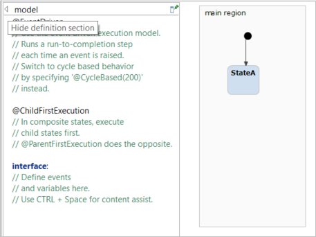
Collapsing the pinned definition section
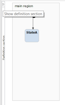
Expanding the pinned definition section
By default, the pinned definition section takes 20 percent of the canvas' view, but you can resize it as you like.
You can unpin the definition section and inline it with the canvas. To do so, click on the pin symbol
 , which in the pinned state is in the definition section’s upper-right corner.
Please note: The definition section is available for top-level diagrams only. If you are editing a subdiagram you will need to use the Properties View to edit the definition of your statechart model.
Please also note: Pinning and inlining the definition section changes your statechart model. You have to save it in order to maintain the current status.
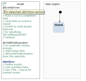
Pinning the statechart diagram definition section
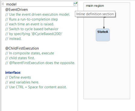
Inlining the statechart diagram definition section
In the pinned definition section, you can edit the name of the statechart by changing the displayed text in the top-center of the section.
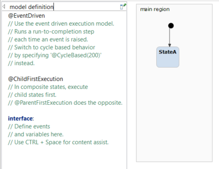
Changing the statechart name
Refactorings Copy link to clipboard
Refactoring means modifying certain model aspects while maintaining the model’s semantics. The statechart editor allows for the refactoring of variables, events, interfaces, and states, including composite and orthogonal states. A state’s context menu contains the Refactor submenu with the individual refactoring actions explained below. Depending on certain conditions, a refactoring might be executable or not, which will be explained below.
Renaming variables, events and interfaces Copy link to clipboard
Using the Rename refactoring, you can change the name of a variable, event or interface throughout your statechart model. Each occurrence of that name will be changed to the new name.
To initiate renaming, right-click on the name of a variable, event or interface in the diagram editor, in the definition section, or in a text field in the properties view, then select Rename ….
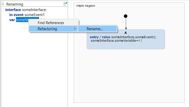
Renaming a variable
- The Rename … dialog opens.
- In that dialog, type the entity’s new name into the text field.
- Click on OK to change each occurence of the old name to the new name.
- Click on Cancel to not rename anything.
Folding incoming actions Copy link to clipboard
When building a statechart model step by step, you may come into a situation where you have defined several transitions having the same target state and sharing a common set of actions.
The Fold Incoming Actions refactoring moves these actions from the transitions to the target state’s entry block. To preserve model semantics, only actions that are defined on all incoming transitions will be moved. Since the execution order must be preserved, the refactoring algorithm starts with the right-most action and proceeds action by action to the left. As soon as it detects an action that is not defined on all incoming transitions, it stops moving actions to the entry block.
Consider the following model:
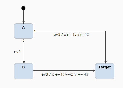
Moving incoming actions to entry block
Only the most-right action y += 42 can be moved to the entry block of the target state. Although x += 1 is also a common action of both transitions, it cannot be moved to the target state, because the semantics of the B → Target transition would change, in that y = x would be executed before x had been incremented.
Another aspect to take into account are transitions leading to target states that are nested in composite states. Consider the following example:
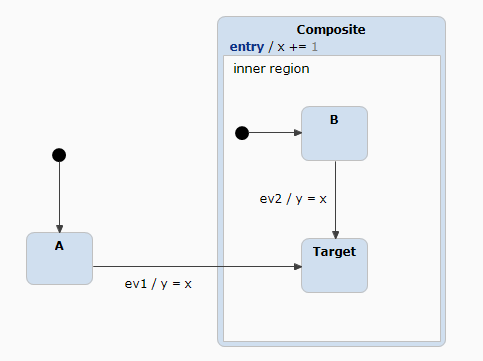
Moving incoming actions into a nested state’s entry block
The actions y = x of the two incoming transitions leading to the Target state cannot be moved to Target's entry block, because doing so would change the model’s semantics. The reason is the composite state’s entry action x += 1. It will be executed after the action of transition A → Target and before the actions in the entry block of Target. Moving y = x from the transition to Target's entry block would change that order. The statechart editor pays regard to this constraint and prohibits the refactoring.
To fold incoming actions, right-click on the state to refactor, then select Refactor → Fold Incoming Actions in the context menu. The menu entry is active only if there are actual actions to move into the target state’s entry block, with the above rules applied.
Folding outgoing actions Copy link to clipboard
The fold outgoing actions refactoring is similar to folding incoming actions, except that it moves actions from outgoing transitions to the source state’s exit block. To preserve model semantics, only actions that are defined on all outgoing transitions will be moved. Since the execution order must be preserved, the refactoring algorithm starts with the left-most action and proceeds action by action to the right. As soon as it detects an action that is not defined on all outgoing transitions, it stops moving actions to the exit block.
Preconditions for this refactoring are analog to "Folding incoming actions". Consider the following example:
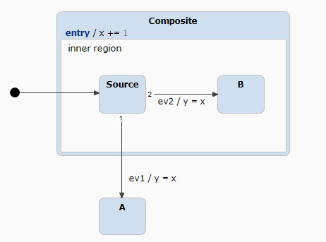
Moving outgoing actions to exit block
Here, the actions y = x cannot be moved from the outgoing transitions to the exit block of the source state, because the composite state has an exit action. For the Source → A transition, the proper execution order is to first execute x += 1 of the nesting composite state’s exit block, followed by y = x of the transition. Moving y = x to the exit block of state Source would reverse this order and thus will be prohibited by the statechart editor.
To fold outgoing actions, right-click on the state to refactor, then select Refactor → Fold Outgoing Actions in the context menu. The menu entry is active only if there are actual actions to move into the source state’s exit block, with the above rules applied.
Unfolding entry actions Copy link to clipboard
This refactoring is the reverse of folding incoming actions. It removes all entry actions from a target state and appends them to each of its incoming transition’s actions.
Transitions crossing the borders of composite states enclosing the target state might inhibit refactoring, see section "Unfolding exit actions" for an analogous example.
To unfold entry actions, right-click on the state to refactor, then select Refactor → Unfold Entry Actions in the context menu. The menu entry is active only if there are actual actions in the state’s entry block that can be moved to the state’s incoming transitions while maintaining semantic equivalence and preserving execution order.
Unfolding exit actions Copy link to clipboard
This refactoring is the reverse of folding outgoing actions. It moves all exit actions from a source state and prepends them to each of its outgoing transition’s actions.
Transitions crossing the borders of composite states enclosing the source state might inhibit refactoring. Consider the following example:
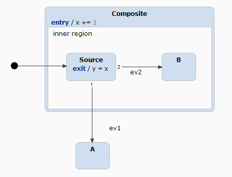
Unfolding exit actions to outgoing transitions
Unfolding the exit action y = x of the Source state to the two outgoing transitions would be invalid, because the execution order of said action and the composite state’s exit action would be reversed.
To unfold exit actions, right-click on the state to refactor, then select Refactor → Unfold Exit Actions in the context menu. The menu entry is active only if there are actual actions in the state’s exit block that can be moved to the state’s outgoing transitions, while maintaining semantic equivalence and preserving execution order.
Grouping states into composite Copy link to clipboard
This refactoring creates a new composite state containing the selected states. The latter must belong to the same region.
To execute this refactoring, select one or more states from the same region, right-click on one of them, and select Refactor → Group States Into Composite in the context menu. The menu entry is active only if the selected states belong to the same region.
Extracting subdiagram Copy link to clipboard
This refactoring extracts the regions of the selected composite or orthogonal state into a subdiagram. Entry and exit points are created as needed in the subdiagram. See section "Using subdiagrams" for more details.
To extract a subdiagram, right-click on the composite or orthogonal state to refactor, then select Refactor → Extract Subdiagram in the context menu.
Inlining subdiagram Copy link to clipboard
This refactoring inlines the selected node’s subdiagram in order to show it directly in the composite state’s diagram region. See section "Using subdiagrams" for more details.
To inline a subdiagram, right-click on a composite state with a subdiagram, then select Refactor → Inline Subdiagram in the context menu.
Using editing proposals Copy link to clipboard
Using text proposals Copy link to clipboard
Proposals assist you when writing statechart language expressions. Whenever editing some text anywhere in the graphical statechart editor or in the properties view, at any point you can press the
[Ctrl+Space] key combination to get some context-sensitive help.
Certain proposals, like statechart language keywords, have documentation associated with them. When such a proposal is selected, either using the mouse or the keyboard, this information is shown in a secondary pop-up window next to the proposal.
You can either use the mouse or the keyboard to select and insert a proposal in the text:
- Double-click on a proposal to insert it in the text at the current position.
- Use the up and down arrow keys to navigate to the proposal you want to insert in the text, then press
[Return]to actually insert the proposal at the current position.
Using actions proposals on states Copy link to clipboard
When a state is selected,
[Ctrl+Space] opens a pop-up window showing a context-sensitive menu with possible action choices to perform on the state.
These action proposals have additional information associated to them. When a proposal is selected either using the mouse or the keyboard, this information is shown in a secondary pop-up window next to the proposal.
You can either use the mouse or the keyboard to execute a proposal:
- Double-click on a proposal to execute it.
- Use the up and down arrow keys to navigate to the proposal you want to execute, then press
[Return]to actually execute it.
Searching and navigating in statecharts Copy link to clipboard
itemis CREATE support you in quickly finding model elements and navigating to them.
The larger the model, the greater the need to quickly search for certain elements, e.g., for all states with a given name or name pattern, all occurrences of a certain variable, etc. itemis CREATE' searching functionality helps you master even large statecharts.
Searching via search dialog Copy link to clipboard
One option, and the most complex one, is to use the search dialog. You can open it using the
[Ctrl+H] shortcut or by selecting
Search → Search… in the main menu.
Doing so will open a dialog with several tabs, as shown in the following screenshot:
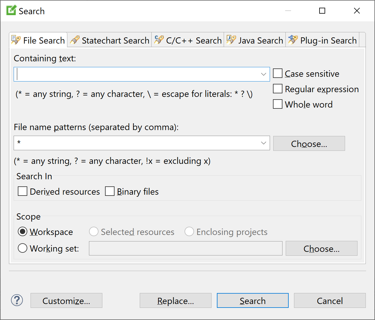
The tab you want to use is Statechart search.
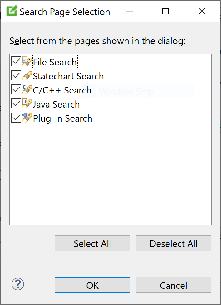
Please note: If you cannot find this tab, you probably disabled it in the past by mistake. You can enable it again by clicking on the Customize… button and selecting Statechart Search, as shown by the following figure:

Switching to Statechart search will show you a clean and easy to understand dialog, which can be extended using the Show advanced settings check box for a more professional usage. The following subsection describes the possible settings.
User tip: Checking the Remember last used page option in the Customize dialog will help you to keep the focus on the Statechart Search tab for further search processes.
Search dialog settings Copy link to clipboard
The Statechart search dialog has several options to control your search.
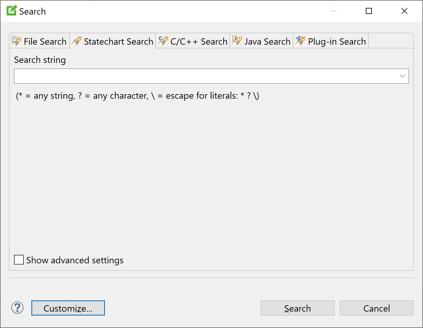
The following table lists the various search options and explains what the search function does if the corresponding checkmark is set.
| Setting | Description |
|---|---|
| Case sensitive | Differentiate between upper-case and lower-case letters in the search string. If this option is not checked, upper-case letters and their corresponding lower-case letters are regarded the same. |
| Regular expression | Interpret the search string as a regular expression. Please note that itemis CREATE supports Java regular expressions, as explained in the java.util.regex.Pattern class API documentation. |
| Search for states/regions | Include states and regions with matching names in the search result. |
| Search for declarations | Include matching declarations in the search result. Declarations are statechart language elements in the definition section, such as variables, events, operations, and named interfaces. The search function will find all occurrences of matching elements. |
| Search for properties | Include elements with matching
properties in the search result. The following items are regarded as properties:
|
| Scope: workspace | Perform the search operation on all statecharts in the workspace. |
| Scope: selected resources | If a statechart editor has the focus, perform the search operation only on that statechart. If the Project explorer view has the focus, perform the search operation on all statecharts in the selected resources. |
Search view Copy link to clipboard
After setting the search options as needed, run the search using the Search button. The search results will be shown in a view called Search.
We will demonstrate the search view using the light switch example from our five-minutes tutorial, using the following settings:
| Setting | Value |
|---|---|
| Search string | O* |
| Case sensitive | ✘ |
| Regular expression | ✘ |
| Search for states/regions | ✔ |
| Search for declarations | ✔ |
| Search for properties | ✔ |
| Scope: Workspace | ✔ |
| Scope: Selected resource | ✘ |
The search view consists of three main components and looks like the following screenshot.

| Component | Functions |
|---|---|
 Searchbar text section Searchbar text section
|
Displays the search string and the number of matches. The latter is updated while the search is running. |
 Toolbar section Toolbar section
|
See section "Toolbar section" |
 Result section Result section
|
See section "Result section" |
Toolbar section Copy link to clipboard
The toolbar section consists of ten buttons with the following functionalities:
| Button | Action | Functionality |
|---|---|---|
|
|
Redo search | Executes the same search again on the possibly changed model. |
|
|
Cancel searching | Cancels a currently running search. The button is active only if a search run is being executed. |
|
|
History | Use this function to display the search history, to select a formerly-executed search (click on Redo search to actually execute it), or to clear the history. |
|
|
Pin search | Pins the results view. Future search results will be shown in a new search view, instead of rewriting the pinned search view. |
|
|
Collapse all | Collapses the search result tree and displays the root entries only. |
|
|
Expand all | Expands the search result tree and displays all search result entries. |
|
|
Search menu | Contains various search options. |
|
|
Minimize | Minimizes the search view and all its sibling views. A “restore” symbol is shown in a sidebar. |
|
|
Maximize | Maximizes the search view and all its sibling views to the full window size. |
|
|
Restore | Undoes the Maximize function. This button is shown only if the search view is maximized. |
Result section Copy link to clipboard
The result section displays the matching statechart elements in a two-column, tree-based view.
- The left-hand column, named Location, shows location and type of each match. Additionally, the whole path from the project down to the matching element is shown.
- The right-hand column, named Matches shows the matches themselves. Intermediate path elements that are no matches but are displayed in the Location column don’t have a counterpart in the Matches column.

You can perform certain actions on the entries in the first column:
| Action | Function | |
|---|---|---|

|
Click on the
|
“closes” the node and collapses all child nodes. |

|
Click on the
|
“Opens” the node and expands its immediate child nodes. |

|
Double-click on a matching element | Navigates to the matching element in the statechart editor, as long a it is not a descendant of an internal or interface element. |
| Double-click on a non-matching path element | Closes an expanded node, opens a collapsed node. |
Finding references Copy link to clipboard
Another realized search feature is to find references of model elements. You can perform this search on choosing Find references in the context menu of:
- model elements in the editor
- model elements in the project explorer
- referenced object in syntax-checking editors inside statechart models like the definition section or the state behavior editor
This will search for usages of the same element in the local statechart and display them in the search view. Using this method can help you to save time searching for usages of variables, events and operations inside your statechart.
The next section introduces the differences between the first method and this method.
Differences between “Find references” and "Search dialog" Copy link to clipboard
As stated in the previous section, Find references is searching for the usages of the exact same model element as selected, whereas in the Search dialog, you have to enter a search string which will find all occurrences of model elements that match the search string.
Finding occurrences of model elements matching the search string makes it possible to search in different statecharts at the same time, while finding references of a model element is limited to the statechart defining that model element. Depending on your search goals, one method could be more suitable than the other.
To clarify the difference between these methods, different search operations were done using the same model. The used model can be taken from the following figure. It does not have any meaning and is only used for clarification purposes.

| Search operation | Results |
|---|---|
| Find references on variable test in the default (unnamed) interface | Finds two matches:
|
| Find references on variable test in named interface first | Finds one match:
|
| Find references on state test | Finds one match:
|
| Search Dialog with the same settings as in section "Search view" and "test" being the search string | Finds four matches:
|
| Search Dialog with the same settings as in section "Search view" and "test" being the search string | Finds one match:
|
| Search Dialog with almost the same settings as in section "Search view", but with Search for declarations deactivated and with "test" being the search string | Finds match:
|
| Search Dialog with almost the same settings as in section "Search view", but with Search for states/regions deactivated and with "test" being the search string | Finds three matches:
|
As can be seen in this case the search dialog has problems with searching references for the variable test in the unnamed interface.
Open model element Copy link to clipboard
Open model element is another kind of search method. It can be used to quickly navigate to states and regions. To access
Open model element, use the
[Ctrl+Shift+Q] shortcut or select
Navigate → Open model element in the main menu.
By doing so, the dialog shown in the next screenshot will open.
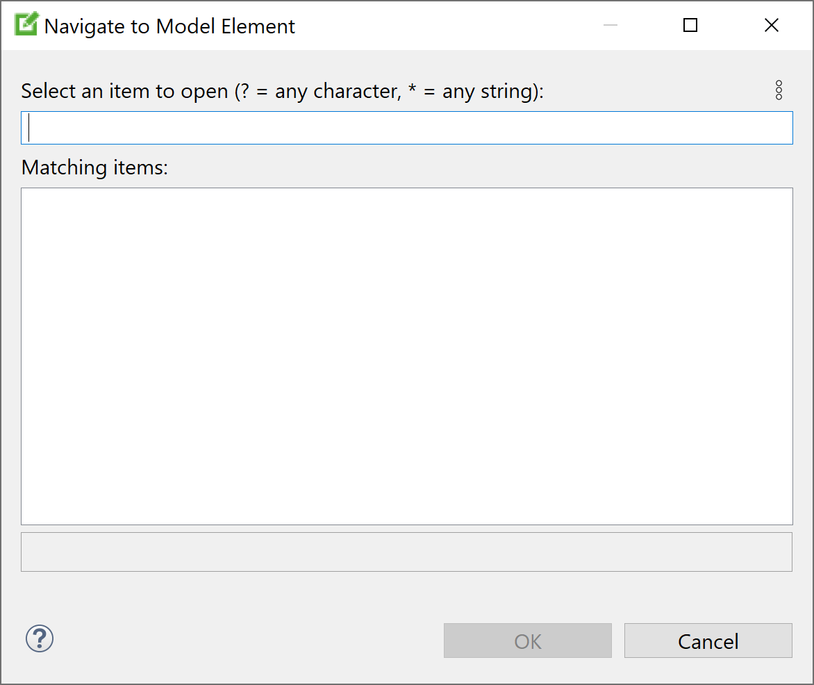
The dialog consists of a single input element
 and two output elements
 /
/
 .
.
A search operation performed with Open model element is equivalent to "Searching via search dialog" with the following setting:
| Setting | Value |
|---|---|
| Search string | same as in

|
| Case sensitive | ✘ |
| Regular expression | ✘ |
| Search for States/Regions | ✔ |
| Search for Declarations | ✘ |
| Search for Properties | ✘ |
| Scope: Workspace | ✘ |
| Scope: Selected resource | ✔ |
Differences between
Open model element and
Search dialog are subtle, but noticeable. The results will promptly appear in
 while typing your search string in
 . The hierarchy of a selected result is displayed in
 as a text instead of using a tree.
Navigating to a result can be done by double-clicking on the result. Or select the result and clicking on the
OK button or hit the
[Enter] key.
The Open model element dialog remembers any matching search results. On reopening the dialog, remembered model elements matching the new search string will be displayed above any newly-found elements. This makes it easier to navigate to them again at a later time.
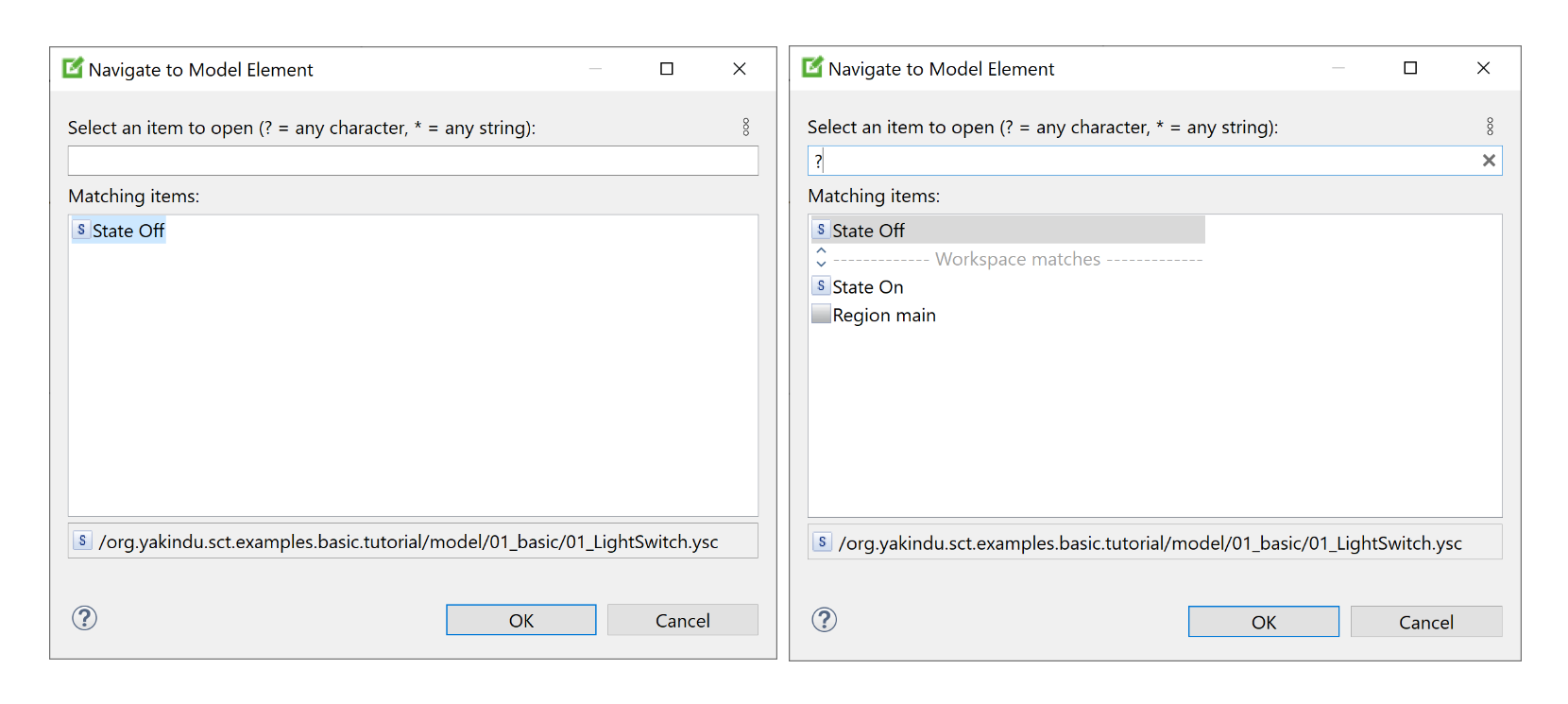
Remembered elements can be removed from the history by selecting them and pressing the
[Del] key or by right-clicking on a remembered element and choosing
Remove from history in the context menu.
Comparing statecharts Copy link to clipboard
The statechart editor allows for comparing two or even three statecharts to each other, displaying the results, and possibly merging selected differences. Figure "Comparing two statecharts" shows a sample comparison result.
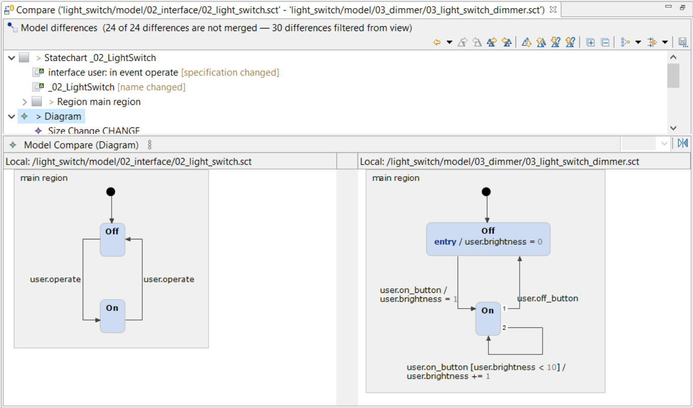
Comparing two statecharts
Comparing a statechart to its local history Copy link to clipboard
Whenever a statechart is saved to its statechart file, the previous version of the file is saved to the local history.
Warning: The local history typically contains a few recent versions of a file. However, you should never rely on anything being available in the local history at all. It is definitely no replacement for a data backup or a version control system
To compare a statechart to an older version in the local history, proceed as follows:
- In the project view, right-click on a statechart model file. The context menu opens.
- In the context menu, select Compare With → Local History….
- In the local history, double-click on the file’s version to compare to.
- The comparison results are shown.
Comparing two statecharts Copy link to clipboard
To compare two statecharts, proceed as follows:
- In the project view, select two statechart model files.
- Right-click on one of the selected statechart model files. The context menu opens.
- In the context menu, select Compare With → Each Other.
- The comparison results are shown.
Comparing three statecharts Copy link to clipboard
To compare three statecharts, proceed as follows:
- In the project view, select three statechart model files.
- Right-click on one of the selected statechart model files. The context menu opens.
- In the context menu, select Compare With → Each Other.
- The Select common ancestor dialog appears. It shows the three selected statechart model files.
- Select one of them. It will be regarded as the common ancestor of the two others.
- The comparison results are shown.
Exporting a statechart as an image file Copy link to clipboard
A complete statechart or parts of it can be saved as an image file as shown in the following steps:
- In the statechart editor:
- To create an image file of the whole statechart with all regions and definition sections, inline the definition section via the button on the top right of it and then right-click on the main region and select File → Save As Image File....
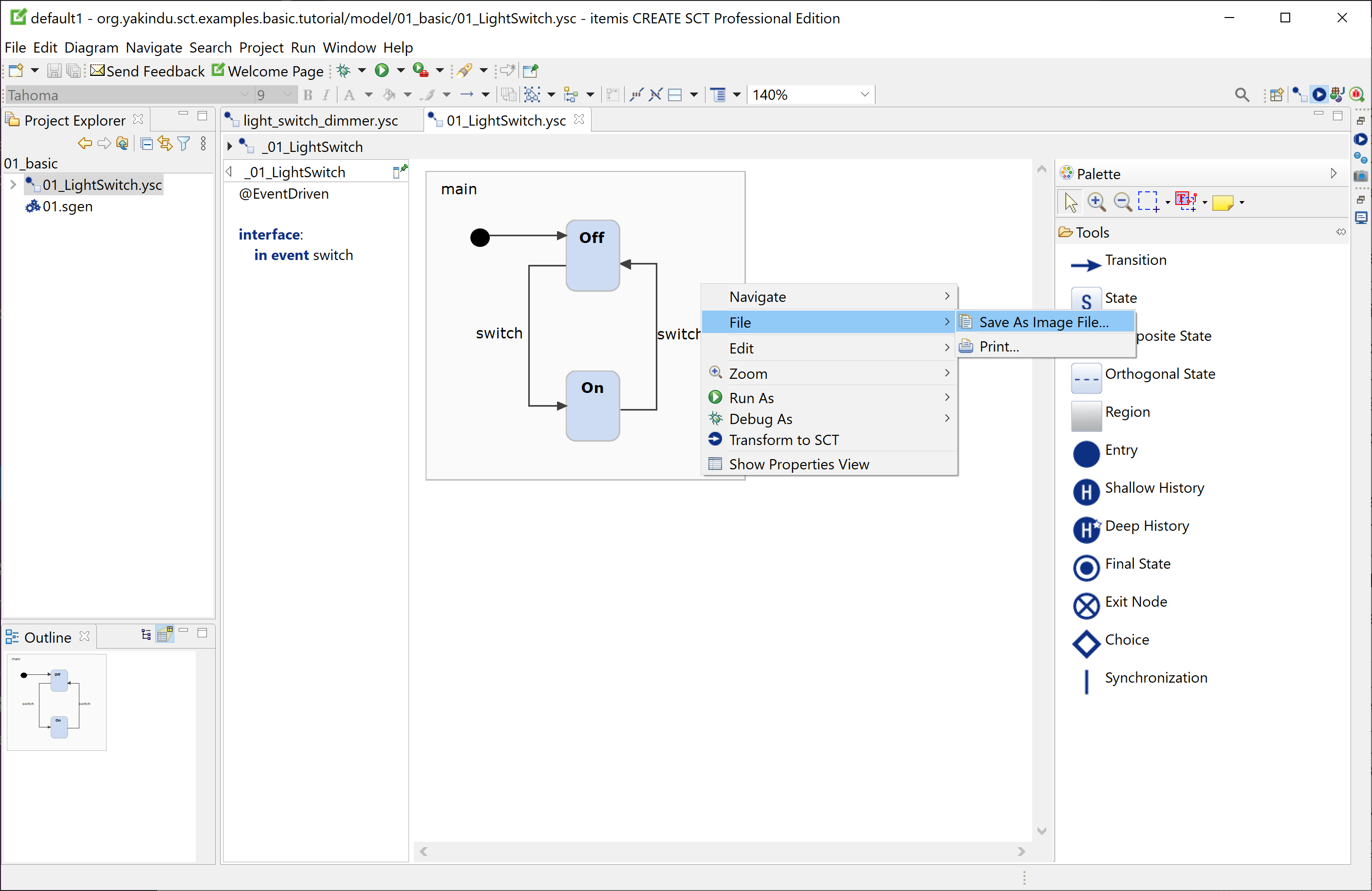
- To create an image file of some statechart elements, select these elements and right-click on one of them. In the example below, the main region has been selected.
- The context menu appears.

- In the context menu, select File → Save As Image File....
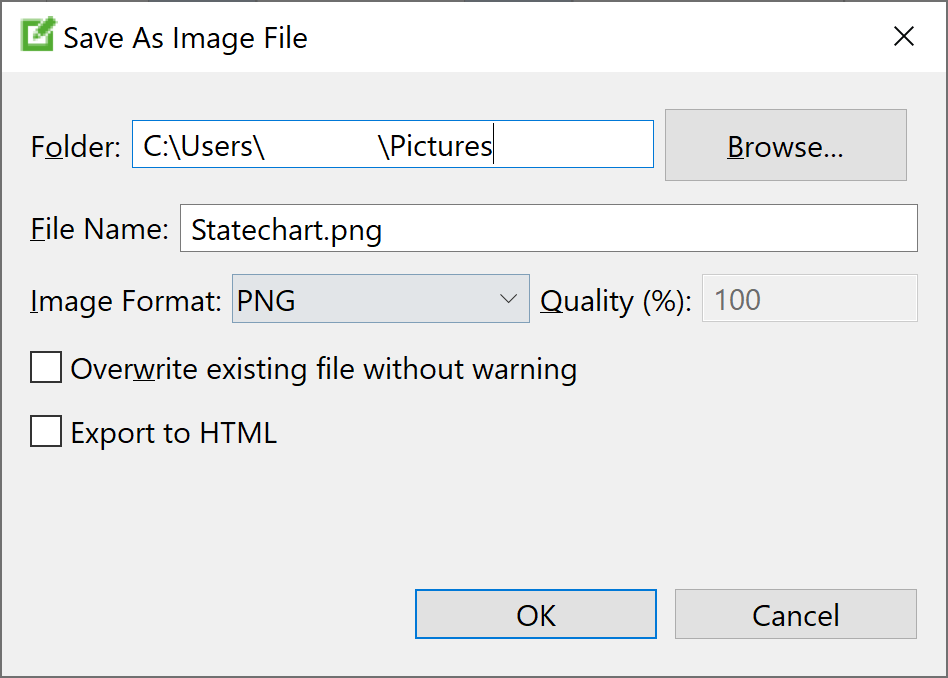
- The
Save As Image File dialog appears.

- Specify the filesystem folder for the exported image file in the Folder text field.
- Enter the name of the export image file into the File Name text field. The filename extension depends on the selected image format (see below).
- Select the image format from the
Image Format drop-down menu. itemis CREATE supports the following formats:
Image format Description BMP, PNG Lossless pixel image formats JPG, JPEG Lossy pixel image format. You can specify the image quality via the Quality (%) setting. SVG Scalable Vector Graphics PDF Portable Document Format Note
The image export functionality is subject to the capabilities of your Java Runtime Environment (JRE). You can export images only in those image formats your JRE actually supports.
- The Quality (%) text field is active for JPEG images only. JPEG is a lossy format, and reducing the quality results in a smaller file size. However, due to the nature of statechart images, a lossless format like PNG is most often a better choice, for sure in quality and perhaps even in file size.
- Check Overwrite existing file without warning if you don’t want to be bothered by a confirmation dialog which will appear if the export file already exists.
- Check Export to HTML to create both the image file plus an HTML file including it.
Working with statechart tasks Copy link to clipboard
While you are busily developing a statechart, it is quite common that you have ideas about what else you could or should do to improve the statechart. However, in order to not get side-tracked, you decide to do it later. Examples are to write a proper documentation for a state, to refine a transition whose final specification you don’t have yet, etc.
For all these and other purposes you can define
tasks in all places in your statechart where a comment is allowed. A task is a special comment comprising the words
FIXME or
TODO. Adding one of these words to a comment is called “tagging” the comment as a task.
The nice thing is that you don’t have to remember all the places you took a note and defined a task. itemis CREATE lists all of your tasks in the tasks view. Figure "Tasks defined by tags in the statechart showing up in the tasks view" is showing an example with various tasks being defined in a transition, in a state’s behavior, in a state’s documentation, and in the statecharts definition section.
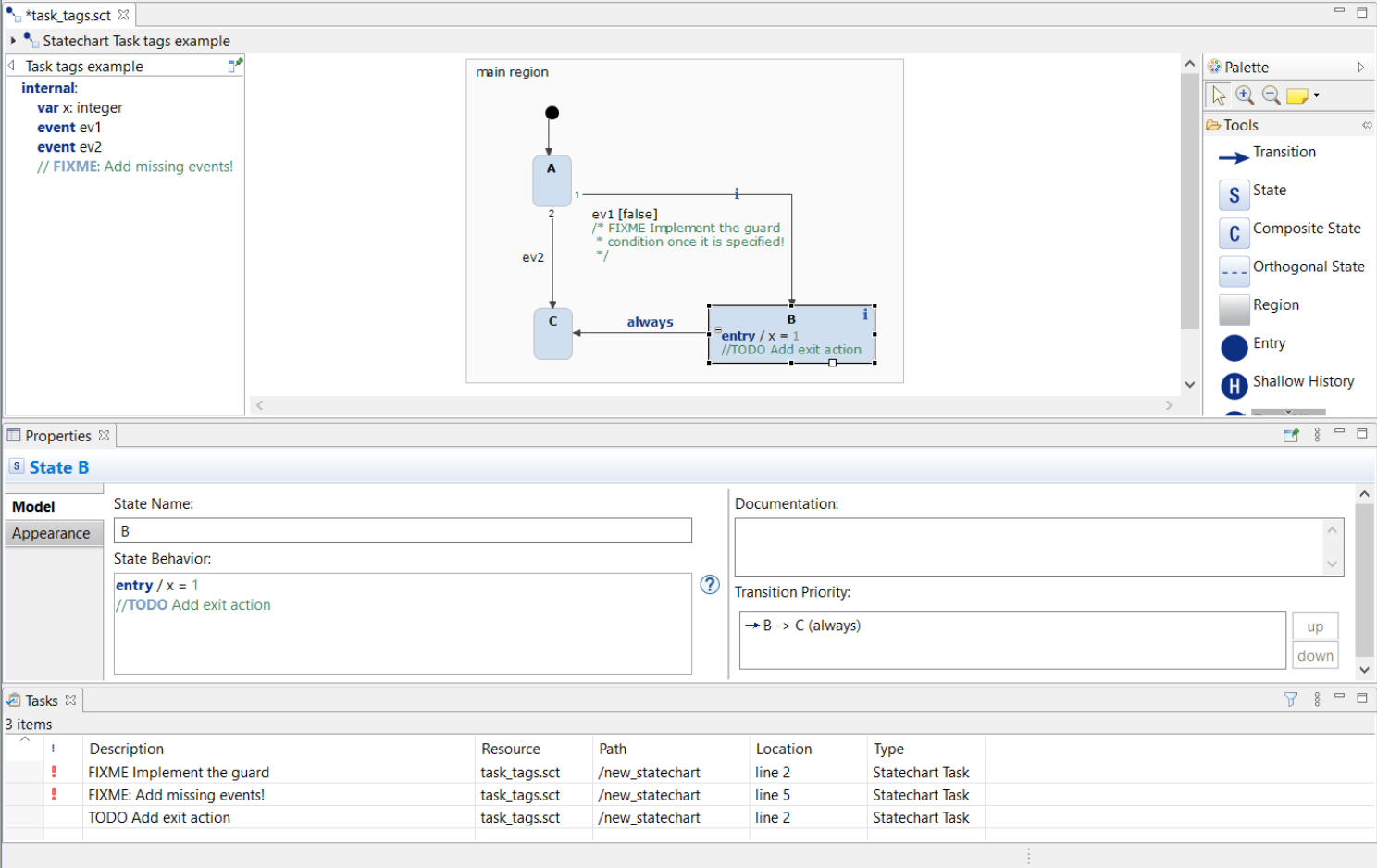
Tasks defined by tags in the statechart showing up in the tasks view
In the example, state B has been selected in the statechart editor (top), so that the tasks defined in the state’s behavior and in its documentation are shown in the properties view (middle).
Task have a priority. While
TODO stamps a task as being of normal priority,
FIXME indicates a high-priority task.
By default, tasks are ordered by priority in the tasks view (bottom), and high-priority tasks are accentuated by a red exclamation mark. However, you can change the sorting order and other settings using the view’s menu. Click on the little triangle on the right-hand side of the task view’s title to open the view menu.
Double-clicking on a task in the tasks view navigates to the location where the task is defined. If needed, the corresponding statechart diagram is opened. The graphical element holding the task definition is highlighted.
Note
The tasks view is updated only when the statechart is saved.
Using the example wizard Copy link to clipboard
The example wizard gives you convenient access to the examples in the public itemis CREATE examples repository. You can browse the available examples and read their documentation in the wizard. By a simple click you can instantiate an example as a new Eclipse project. Within such a sample project, you can explore and modify the state machine models using the statechart editor, run the state machines in the simulator, generate source code, etc.
Upon its first invocation, the example wizard downloads the complete examples repository and creates a copy on your local disk. After that, all examples are immediately available to you, even if you are offline. The example wizard will take notice when new examples are available in the online repository and offers to download them. It is also possible to download the examples repository out-of-band and later tell the example wizard where it can find the local copy.
Downloading the examples repository Copy link to clipboard
When you start the example wizard for the first time, it does not yet have any examples available that it could show to you. Thus downloading the online examples repository is required as a special first step.
- In order to start the example wizard, select File → New → Example… in the itemis CREATE main menu. The New Example dialog opens.
- In the New Example dialog, select itemis CREATE Examples, then click on Next >. The example wizard opens.
- The example wizard outputs a message saying that it could not find any examples and offers to download them.
- Click on the Download button. The example wizard downloads the online examples repository and creates a clone of it on your local computer. This can take some time. – Downloading can fail for a variety of reasons, not being able to access the Github server being one of them. If this happens, don’t panic – and read how to manually create a local copy of the examples repository.
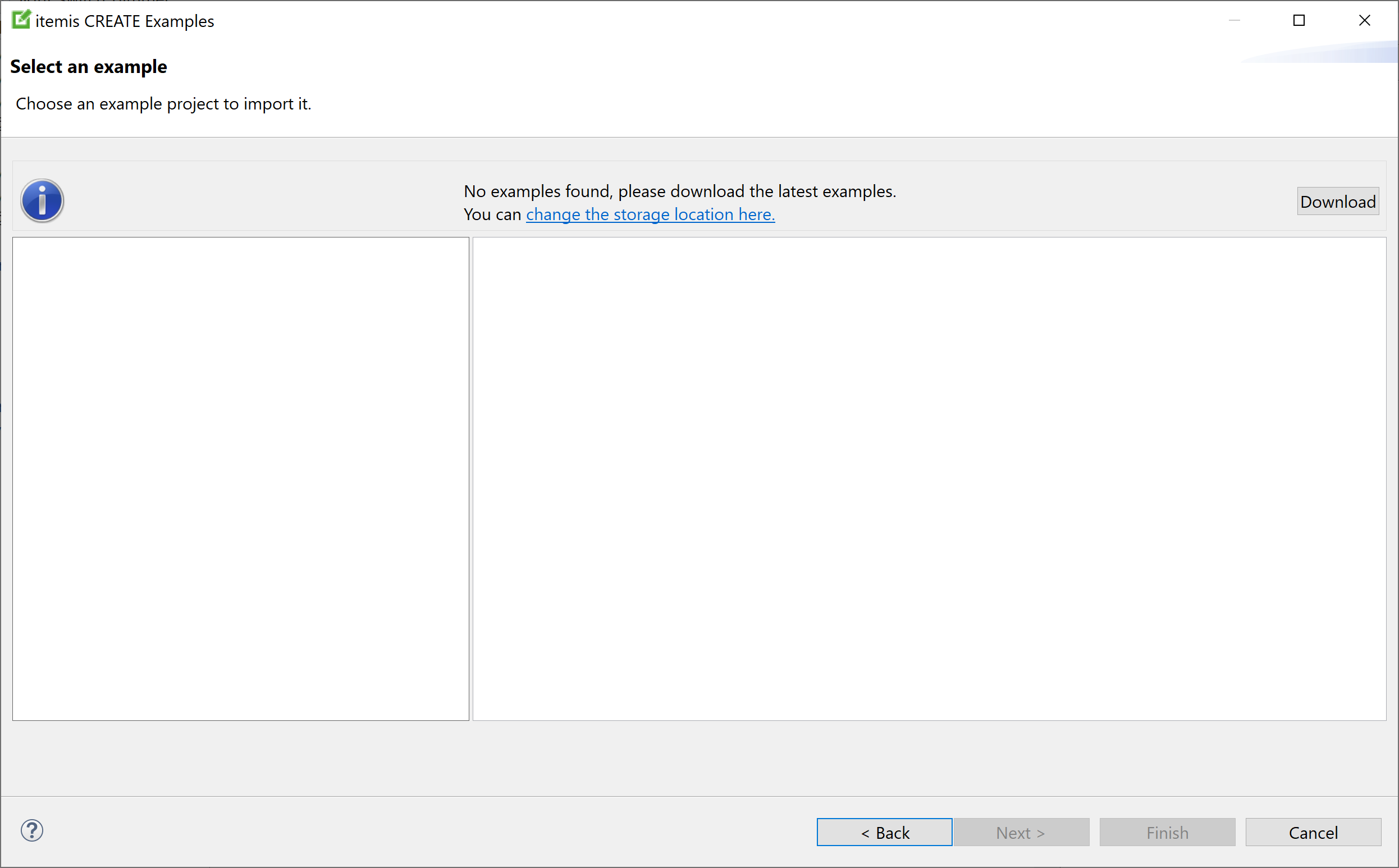
Example wizard when invoked for the first time
When the download is completed, you can browse the examples repository.
Changing the repository location Copy link to clipboard
You can change the location used by the example wizard to store the online repository’s local clone.
- When the example wizard shows the Download button on its first start, click on the link "change the storage location here". The example wizard’s preferences dialog opens. Alternatively, open Window → Preferences and select itemis CREATE → Example wizard.
- On the examples preferences page, enter the desired directory into the Storage Location text field.
- Click on OK. The dialog closes.
You can change the storage location of your local examples repository clone at any time. In fact, it doesn’t even need to be a clone of the official examples repository. Any directory containing subdirectories with itemis CREATE examples suffices.
- If the directory exists, the example wizard searches it for examples and displays them.
- If the directory does not exist, the example wizard behaves as if being called for the first time. That is, it informs the user that it does not have any examples yet and offers to download them.
Browsing the examples repository Copy link to clipboard
The example wizard shows the available examples on the left-hand side.
Click on an example to select it and show its documentation on the right-hand side.
Click on Finish to create the selected example as a new project in your workspace.
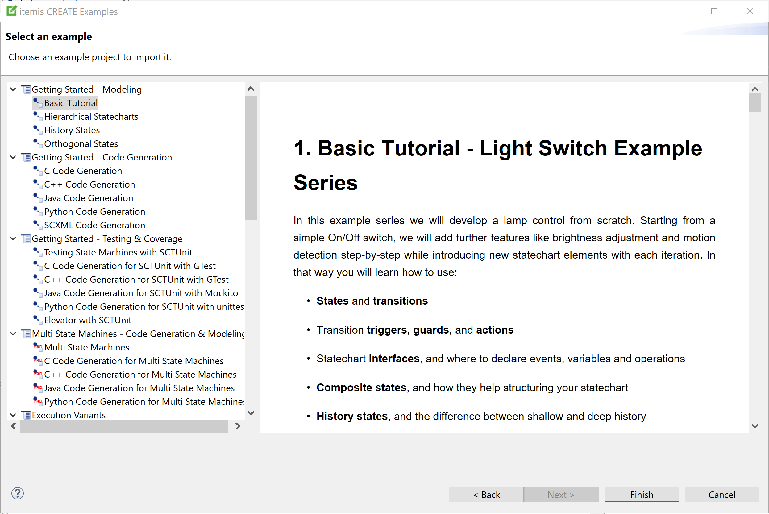
Example wizard showing all available examples
Manually creating a local copy of the examples repository Copy link to clipboard
The example wizard tries to download a copy of the itemis CREATE examples repository and install it on your local machine. However, if your Internet access is restricted or you don’t have Internet access at all, this will fail.
To circumvent this problem, you can
- download the examples repository elsewhere, i. e. on a computer with Internet access,
- copy it to the computer you want to run itemis CREATE, and
- have the example wizard work with that local copy.
Subsequently we will explain the necessary steps in detail.
Downloading the repository as a ZIP archive:
- On a computer with Internet access, go to the examples repository’s release branch.
- Click on the green Clone or download button. A submenu opens.
- In the submenu, click on Download ZIP.
- The download starts and transfers the ZIP archive file examples-release.zip to your computer.
- Copy the examples-release.zip file to the computer without Internet access and continue with the following steps on that machine.
- Unpack the archive file. A directory named examples-release is created, containing the itemis CREATE examples repository.
- In itemis CREATE, select Window → Preferences. The preferences dialog opens.
- In the preferences dialog, navigate to itemis CREATE → Example wizard.
- Click on Browse..., and select the folder that you just extracted from the ZIP file, then click OK.
- On the next try, the example wizard will now show a catalogue of itemis CREATE examples.
Alternatively, you can clone the repository. Cloning the examples repository containing the itemis CREATE examples is more complex than just downloading a ZIP archive. However, you will get certain advantages in return, like the ability to detect and receive updates, the option to create your own examples and submit them as a pull request, or to get hold of the complete history of the examples repository – which could also be considered a drawback, taking its size into account.
- Clone
https://github.com/Yakindu/examples to your local computer. If you are using a command-line tool, the proper command to create the directory
examples on your disk is:
git clone 'https://github.com/Yakindu/examples.git' - Step into that directory:
cd examples - Checkout the
release branch:
git checkout release
Now the examples directory reflects the current release state. - In the itemis CREATE main menu, select File → New → Example…. The New Example dialog opens.
- In the New Example dialog, select itemis CREATE examples and click on Next >. The example wizard opens.
- When the example wizard is opened for the first time, there are no examples on the local disk yet.
- In itemis CREATE, select Window → Preferences. The preferences dialog opens.
- In the preferences dialog, navigate to itemis CREATE → Example wizard.
- Click on Browse..., and select the folder you just cloned, then click OK.
- On the next try, the example wizard will show a catalogue of itemis CREATE examples.
Updating the examples repository Copy link to clipboard
When the example wizard is started and the storage location is a clone of the online examples directory, it checks whether there are any updates in the online examples repository. If new examples are available or existing examples have changed in the online repository, the example wizard offers to update your local examples repository clone accordingly.

Example wizard offering to update the examples repository
- Click on the Update button to update your local repository.
If your storage location is a plain directory and not a clone of the online examples repository, no update will ever be done.
Contributing your own examples Copy link to clipboard
If you have a project that you want to share with the community, you can contribute it as an example. Once the itemis CREATE team has reviewed and applied your contribution, it will be available for all users of itemis CREATE via the example wizard’s update functionality.
For more information on how to contribute examples, please visit our Wiki page.
Preferences Copy link to clipboard
Many aspects of itemis CREATE can be configured by preferences. You can find them here:
- In the main menu, select Window → Preferences. The Preferences dialog appears.
- In the navigation on the left-hand side, scroll to itemis CREATE. Open it and its subentries as needed.
- Click on an entry to display the associated preference page on the right-hand side of the Preferences dialog, see, e.g., figure "Preferences: Diagram appearance".
In the subsequent sections we will quickly walk through the preferences.
Diagram appearance Copy link to clipboard
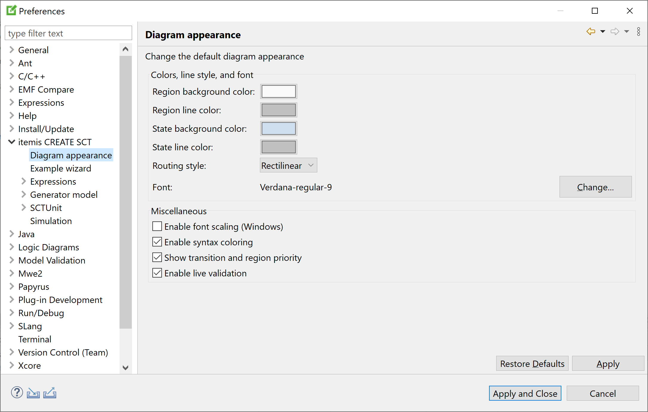
Preferences: Diagram appearance
Colors, line styles, and fonts Copy link to clipboard
The diagram appearance preferences define
- the default colors for the backgrounds and borders of states and regions,
- the default routing style for transitions and other lines, with oblique and rectilinear being the options at your choice, and
- the default font for any text.
Please keep in mind that these settings will apply to new elements only. Existing regions, states, etc. will remain as they are. However, you can modify the properties of an existing element anytime, using its properties view.
Font scaling Copy link to clipboard
This option is only available on Microsoft Windows. By default, font scaling is deactivated in itemis CREATE. If you are working on different machines with different Windows font scaling, this option can be enabled to have the same font and box sizes on all machines.
Syntax coloring Copy link to clipboard
By default, itemis CREATE highlights textual statechart language elements in different colors while the corresponding text fragment is being edited.
If the "Enable syntax coloring" option is checked, syntax highlighting is turned on all the time, i.e., also for text that is not being edited.
You can configure the colors to actually use on the following preference pages:
Definition section pinning Copy link to clipboard
Check or uncheck the "Enable pinning of statechart definition section pinning" option to toggle between pinning and legacy mode of the definition section. Section "Using the definition section" explains what this is all about.
Showing transition and region priorities Copy link to clipboard
In order to display transition and region priorities in a statechart, set a check mark at the respective preference option. Section "Transition priorities" explains what transition priorities are and shows an example.
Disabling live validation Copy link to clipboard
While you are editing a statechart, the statechart editor validates your model on each and every modification you make. That’s very helpful, because the editor provides you with instant feedback, so you can see immediately what is right, wrong, or dubious, and you can take corrective action, if needed.
However, on very large and complex statechart models, validation may take a considerable amount of time, causing delays and impeding your editing. Remove the check mark from Enable live validation, and your model will be validated only before it is saved to the statechart file.
Example wizard Copy link to clipboard
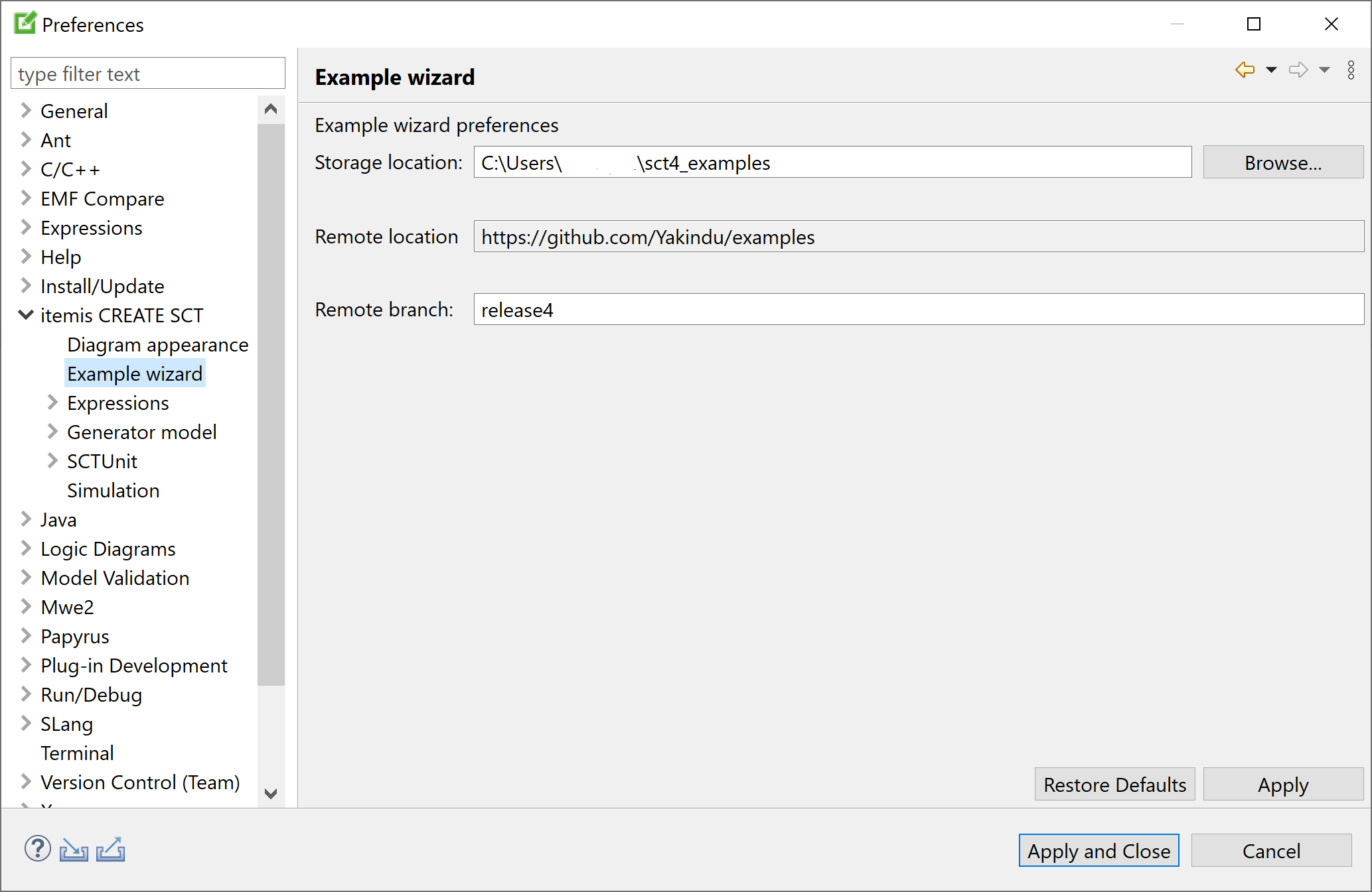
Preferences: Example wizard
You can change the example wizard storage location here. This is a local directory where the example wizard stores your local clone of the examples Git repository. The default is the sct4_examples directory in your home directory.
You could also change the location of the Git repository and the branch to use, but you won’t probably want to do that.
Expressions preferences Copy link to clipboard
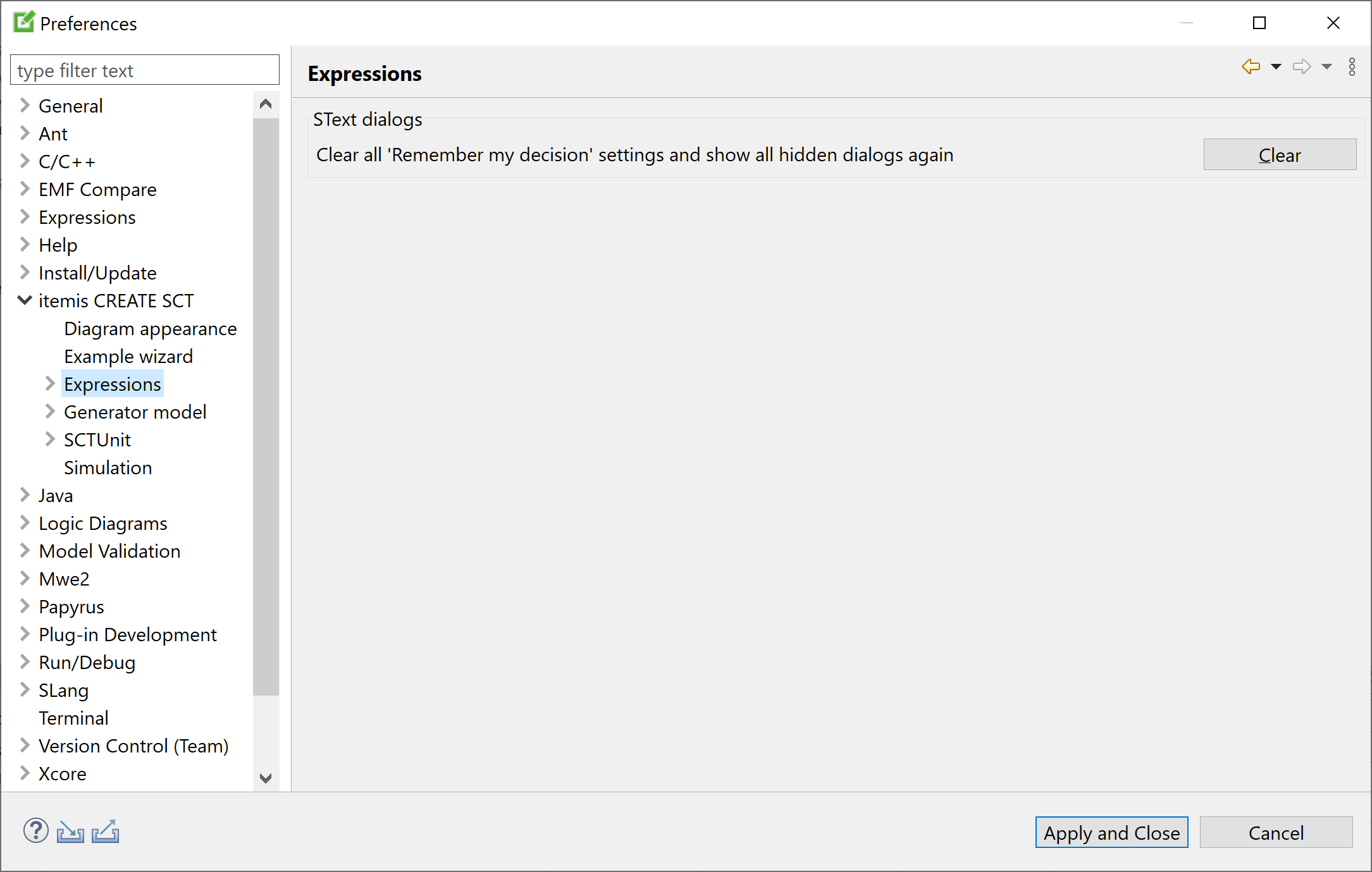
Preferences: Expressions
Certain dialogs in the statechart editor allow you to opt for never seeing them again. By clicking on the Clear button on this preference page the hidden dialogs pertaining to the statechart language will be shown again at their respective locations.
Expression syntax coloring Copy link to clipboard
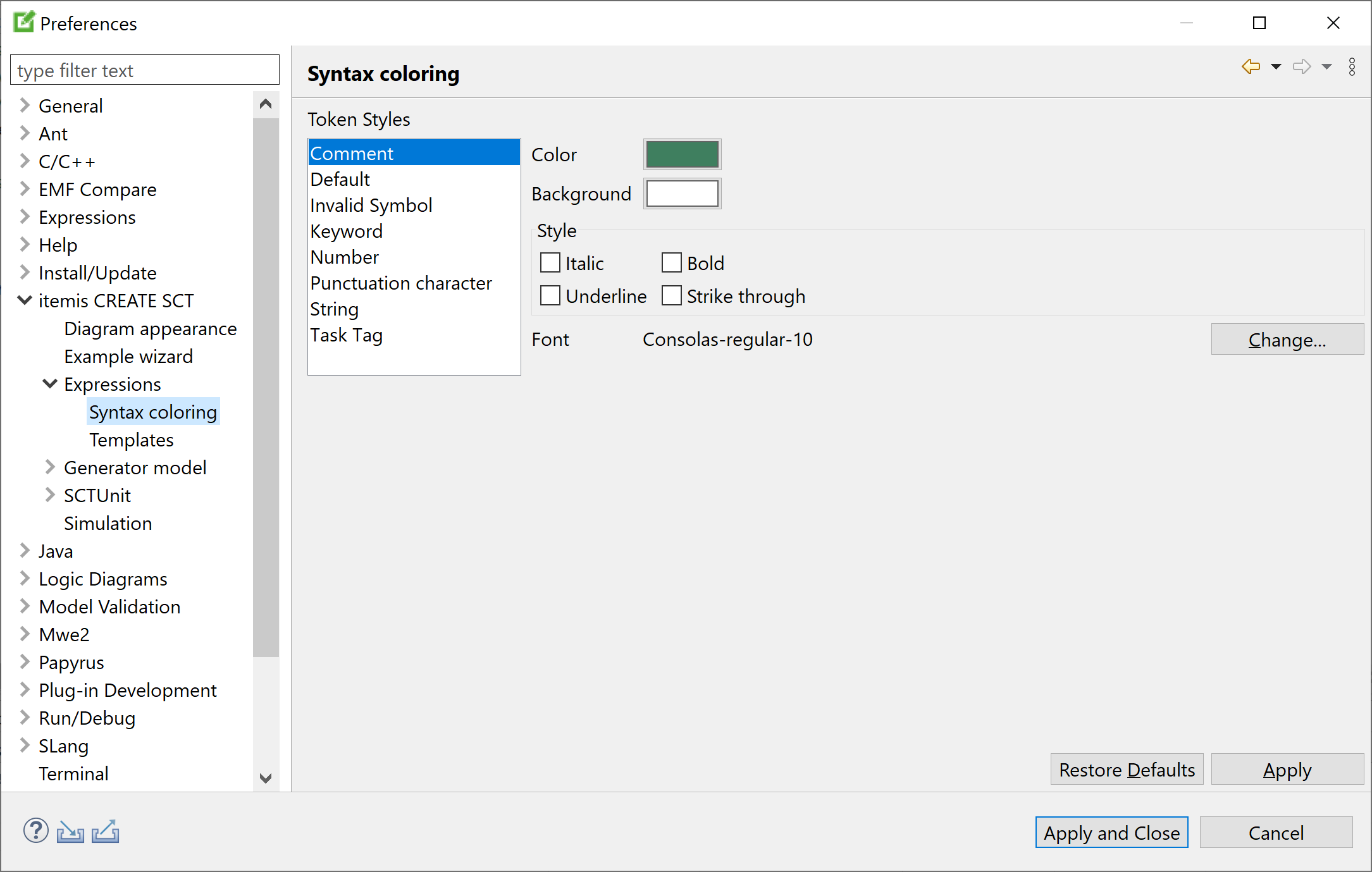
Preferences: Expression syntax coloring
This preference page defines foreground color, background color, font, and style for displaying certain syntactical elements in statechart language texts.
Expression templates Copy link to clipboard
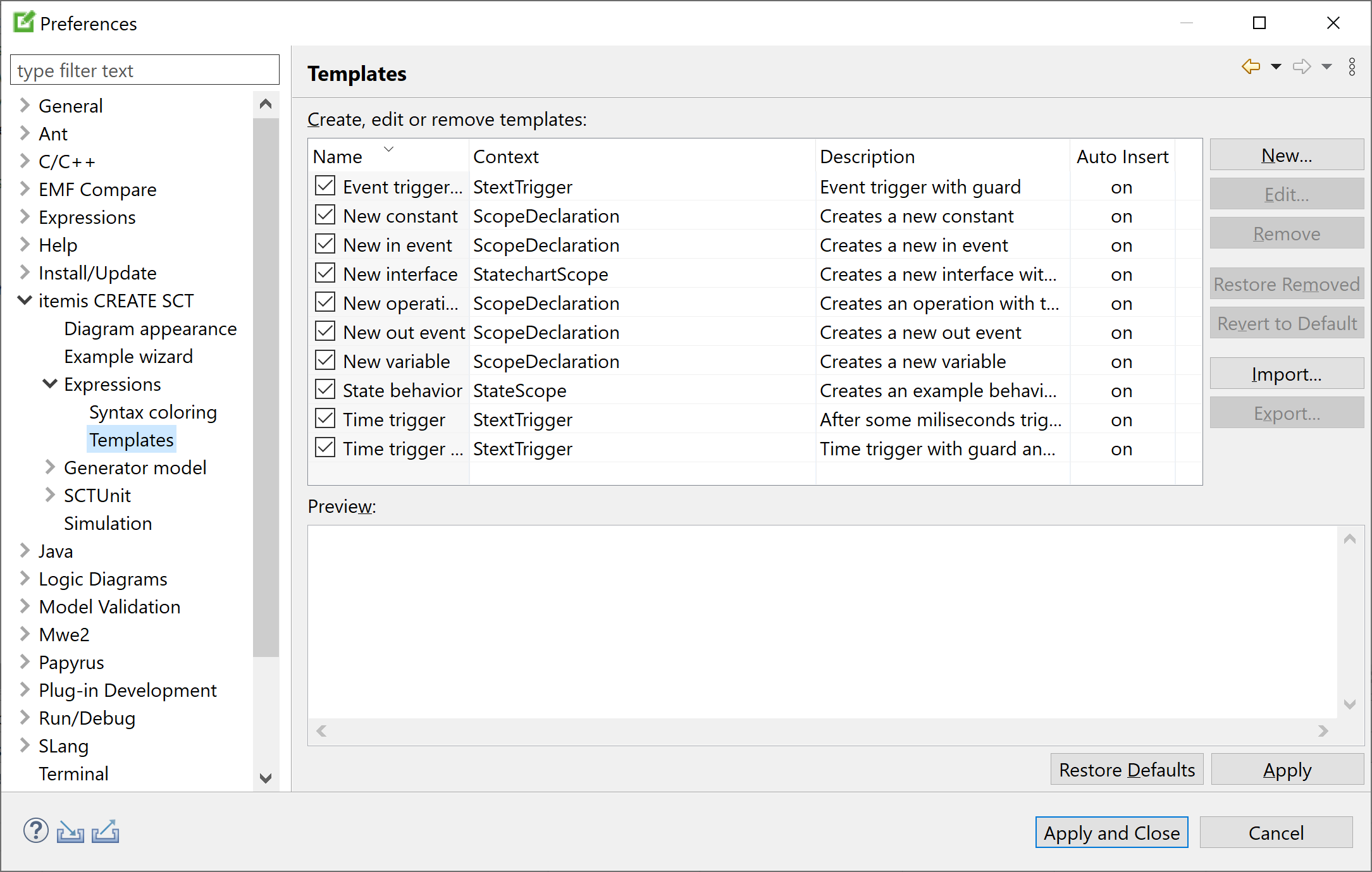
Preferences: Expression templates
Templates are sections of textual code that occur frequently enough to make you want to insert them with a few keystrokes only. This function is known as content assist; the sections of code that are inserted are known as templates.
To insert an existing content assist template, type the initial character, then press
[Ctrl+Space]. The templates whose names begin with that character will appear. Double-click on a template to insert it.
On this preference page you can create, edit, and delete statechart language templates.
Generator model Copy link to clipboard
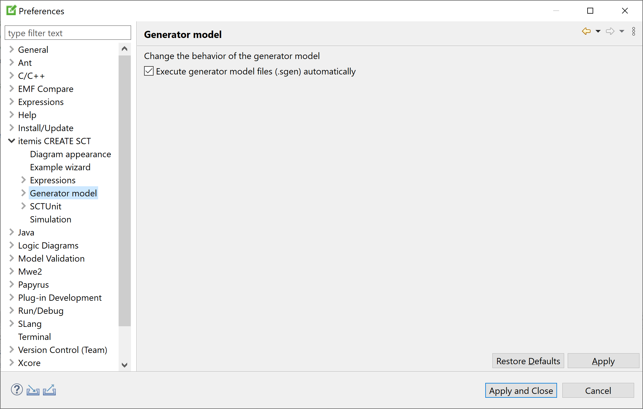
Preferences: Generator model
By default, code generators automatically generate artifacts defined by generator models in .sgen files. Using this preference setting, you can switch this behavior off or on.
Generator model refactoring Copy link to clipboard
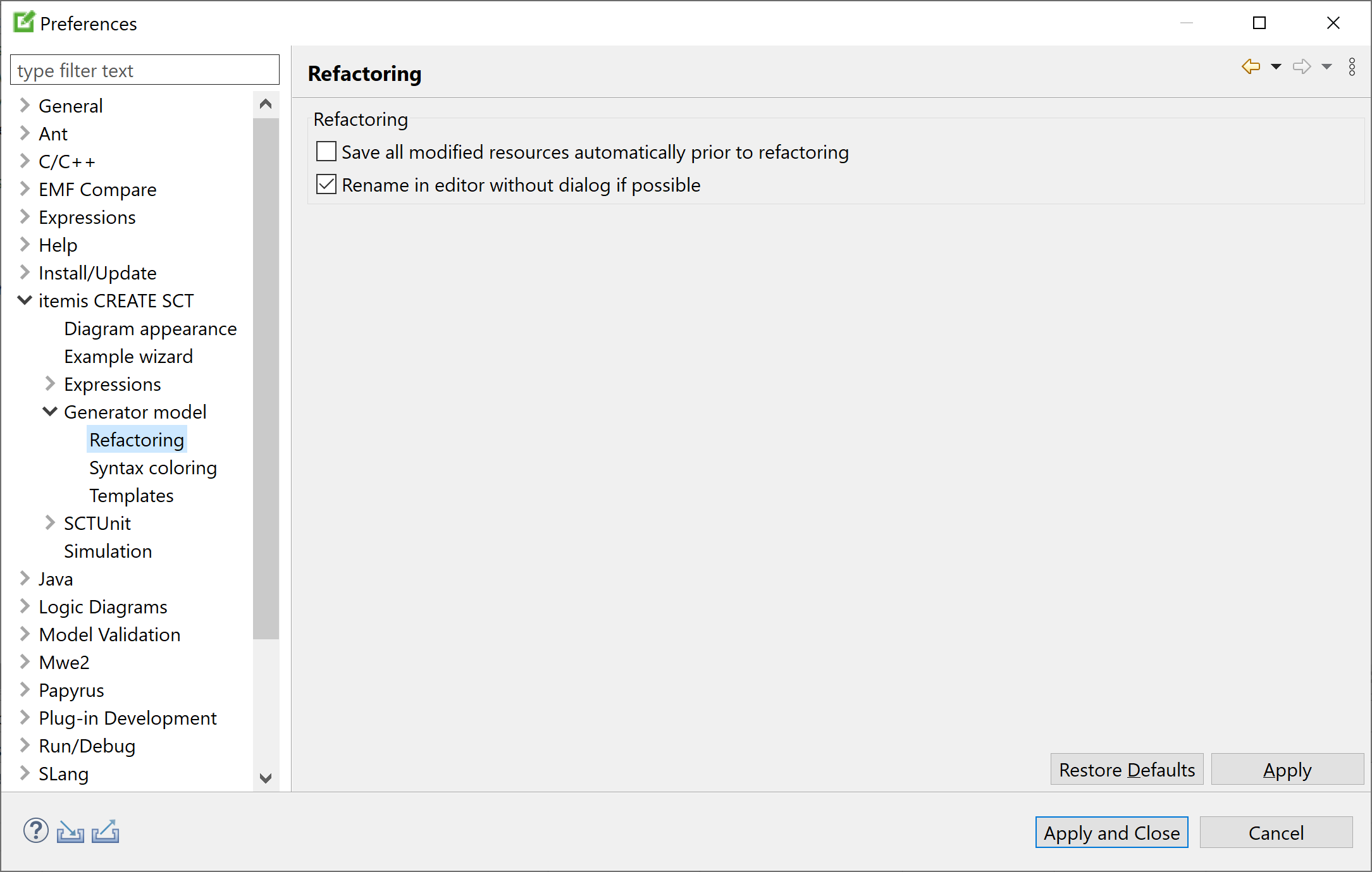
Preferences: Generator model refactoring
Change these preference settings for refactoring in generator models as you see fit.
The "Save all modified resources automatically prior to refactoring" option is somewhat dangerous, because you might have made changes to files that you intentionally do not want to save to disk – or at least not yet. For that reason, this option is turned off by default.
The
"Rename in editor without dialog if possible" pertains to how the renaming operation is performed. By default, if you click on a name and press
[Shift+Alt+R], you can edit the name directly in the source code, and all other occurences of that element are renamed while you are typing. If this is not possible or if this option is not checked, a dialog will ask you for the element’s new name.
Generator model syntax coloring Copy link to clipboard

Preferences: Generator model syntax coloring
This preference page defines foreground color, background color, font, and style for displaying certain syntactical elements in generator model texts.
Generator model templates Copy link to clipboard
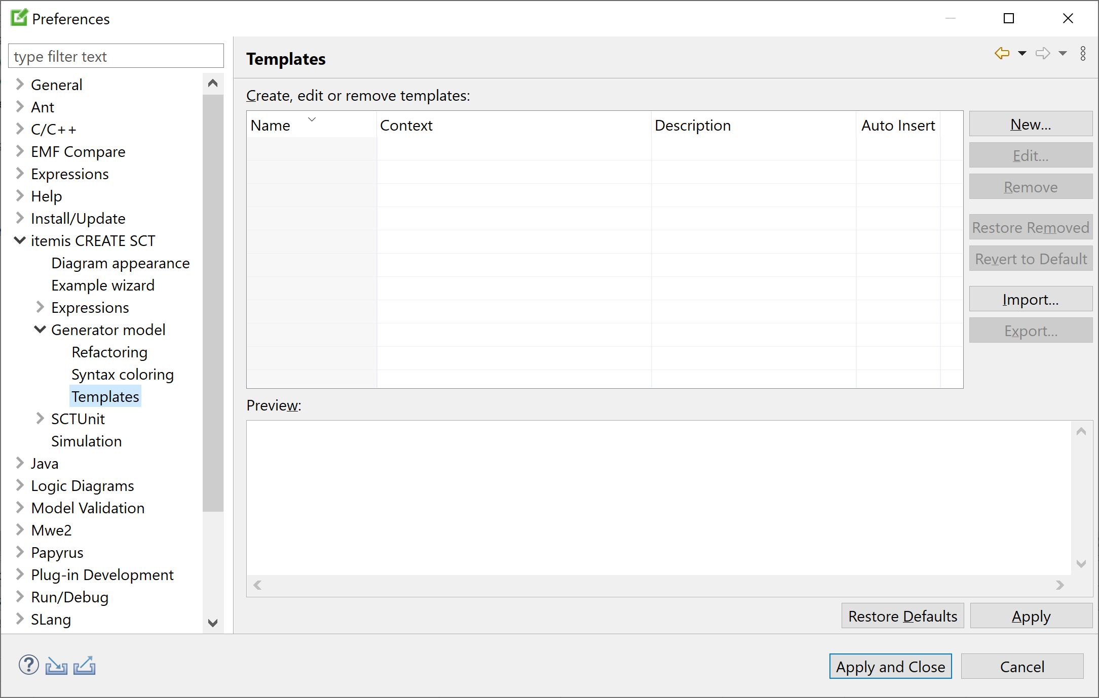
Preferences: Generator model templates
Templates are sections of textual code that occur frequently enough to make you want to insert them with a few keystrokes only. This function is known as content assist; the sections of code that are inserted are known as templates.
To insert an existing content assist template, type the initial character, then press
[Ctrl+Space]. The templates whose names begin with that character will appear. Double-click on a template to insert it.
On this preference page you can create, edit, and delete generator model language templates.
SCTUnit Copy link to clipboard
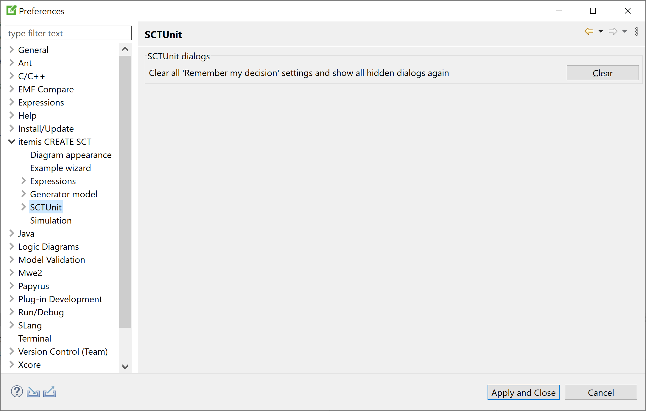
Preferences: SCTUnit
Certain dialogs in SCTUnit allow you to opt for never seeing them again. By clicking on the Clear button on this preference page the hidden dialogs pertaining to SCTUnit will be shown again at their respective locations.
SCTUnit refactoring Copy link to clipboard
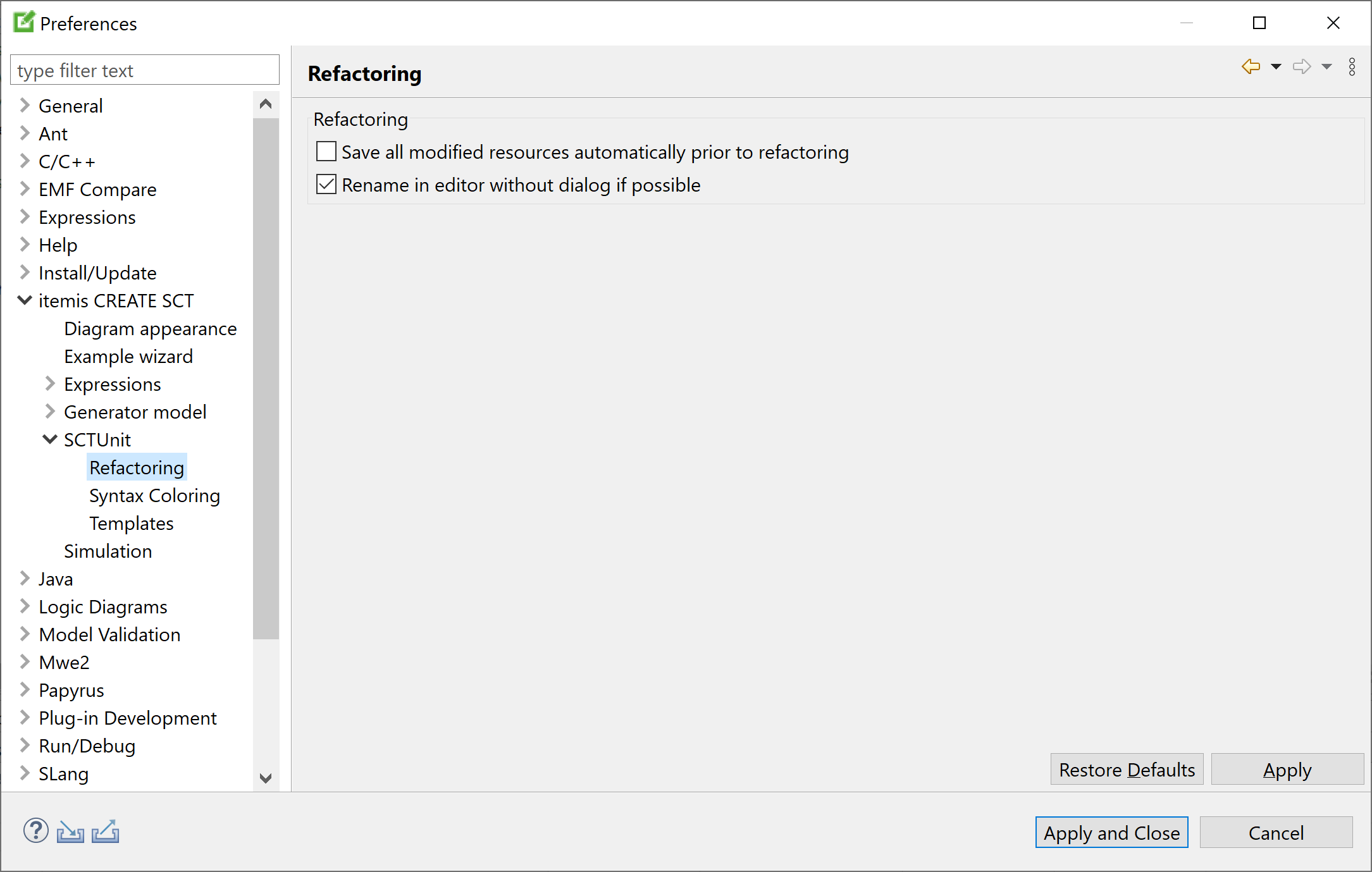
Preferences: SCTUnit refactoring
Change these preference settings for refactoring in SCTUnit source files as you see fit.
The "Save all modified resources automatically prior to refactoring" option is somewhat dangerous, because you might have made changes to files that you intentionally do not want to save to disk – or at least not yet. For that reason, this option is turned off by default.
The
"Rename in editor without dialog if possible" pertains to how the renaming operation is performed. By default, if you click on a name and press
[Shift+Alt+R], you can edit the name directly in the source code, and all other occurences of that element are renamed while you are typing. If this is not possible or if this option is not checked, a dialog will ask you for the element’s new name.
SCTUnit syntax coloring Copy link to clipboard
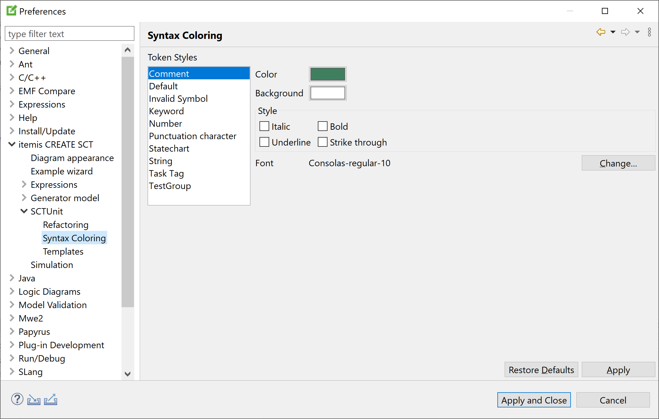
Preferences: SCTUnit syntax coloring
This preference page defines foreground color, background color, font, and style for displaying certain syntactical elements in SCTUnit source texts.
SCTUnit templates Copy link to clipboard
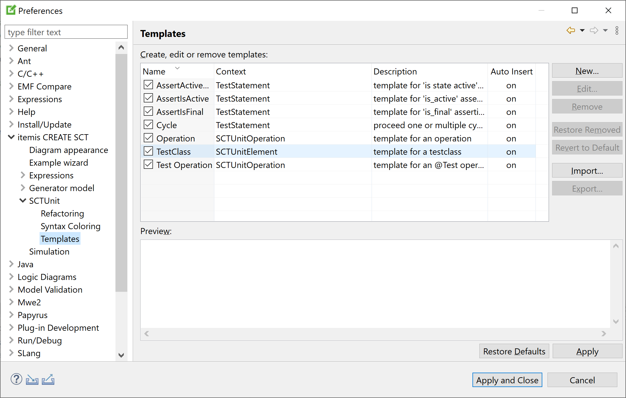
Preferences: SCTUnit templates
Templates are sections of textual code that occur frequently enough to make you want to insert them with a few keystrokes only. This function is known as content assist; the sections of code that are inserted are known as templates.
To insert an existing content assist template, type the initial character, then press
[Ctrl+Space]. The templates whose names begin with that character will appear. Double-click on a template to insert it.
On this preference page you can create, edit, and delete SCTUnit language templates.
Simulation Copy link to clipboard
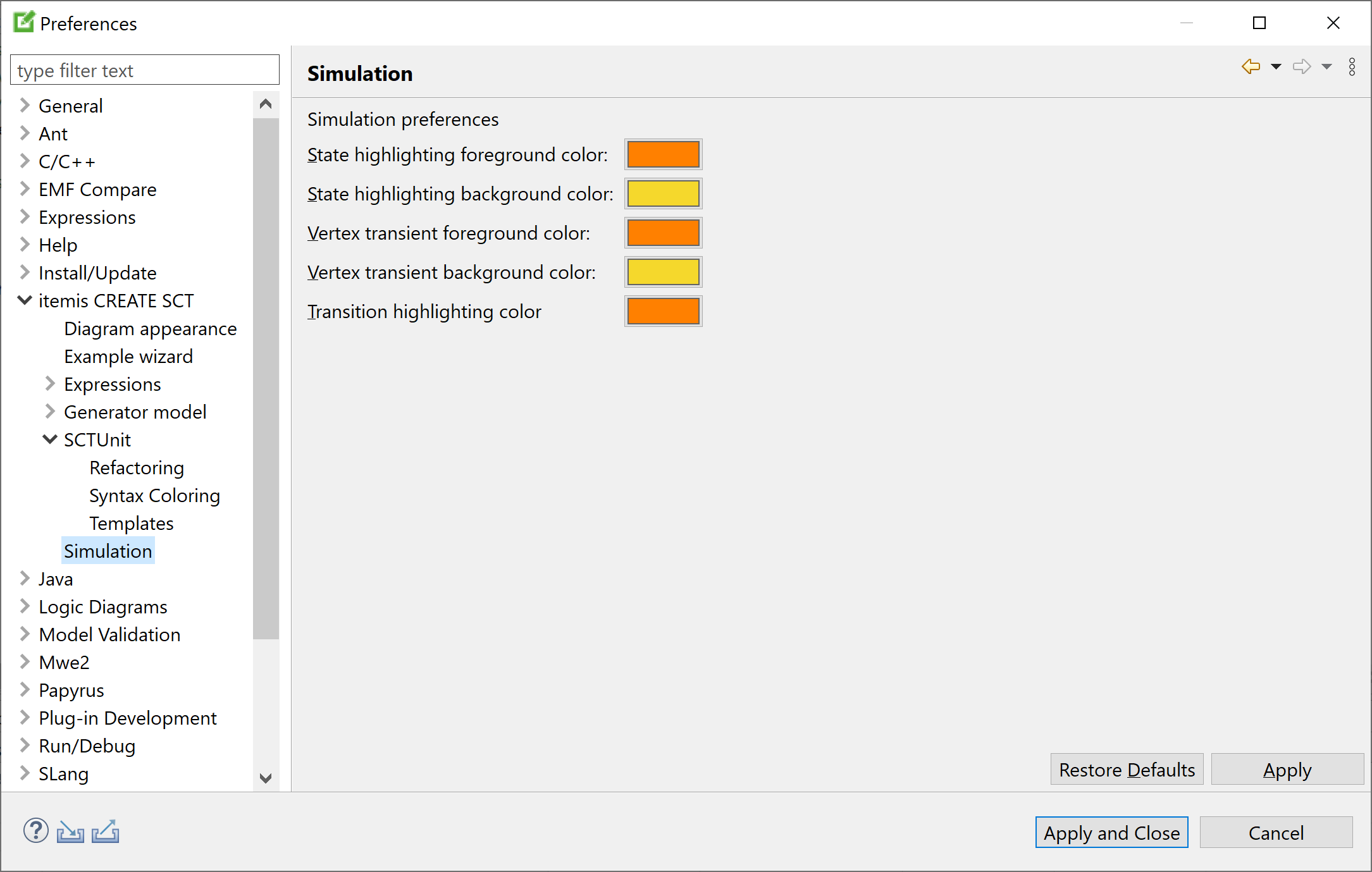
Preferences: Simulation
Set your color preferences for the statechart simulator on this preference page.
